Reef
About
- Brand: Real Estate Endowment Fund
- Year: 2026
- Industry: Non-profit
- Location: Nationwide
- Link:
- Brand Strategy
- Brand Identity
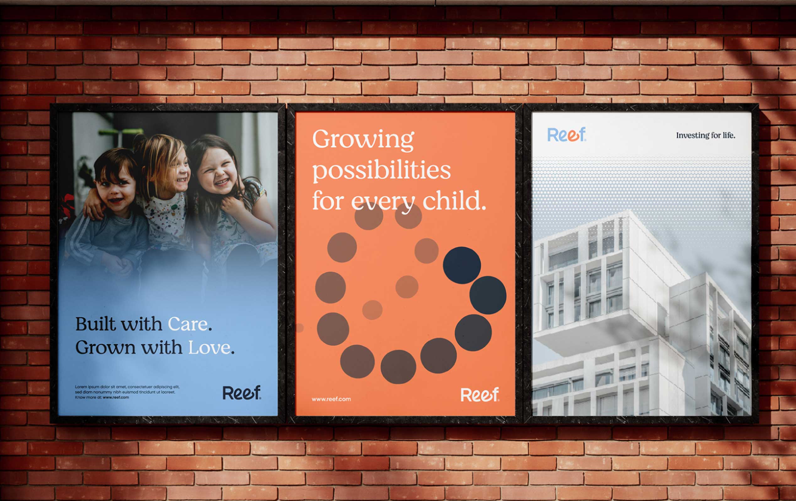
- Collateral Suite (Stationery, One Pagers, Presentation Materials)
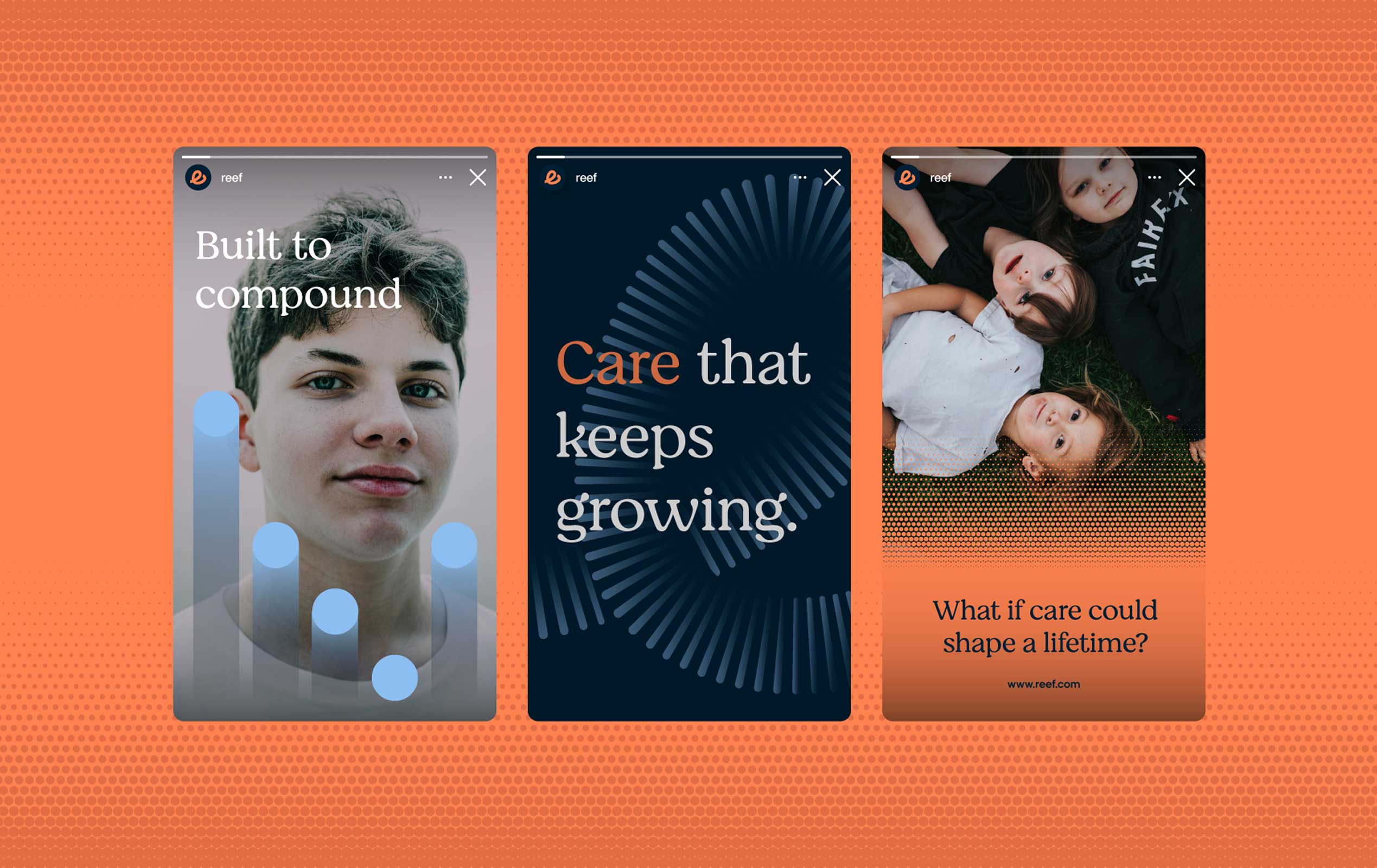
- Digital & Social Advertising Creative
- UX Design
- UI Design
- Website Development
Giving Capital a Long-Term Strategy
REEF — the Real Estate Endowment Fund — came to RPPL with a model that didn’t fit inside a typical nonprofit box. Rather than raise money year over year, REEF pairs donor capital with institutional-quality real estate investment, letting returns compound so that giving becomes a perpetual, growing source of support for underserved K-12 children rather than a one-time gift.
It’s a structure more commonly found in private equity than in philanthropy — and that was exactly the challenge. REEF needed a brand and a website that could hold two things at once: the rigor of an investment vehicle and the warmth of a mission built around children, education, and faith.
Our task was to translate that duality into something donors would trust with their capital and nonprofits would trust with their future.

A Wordmark That Carries the Message
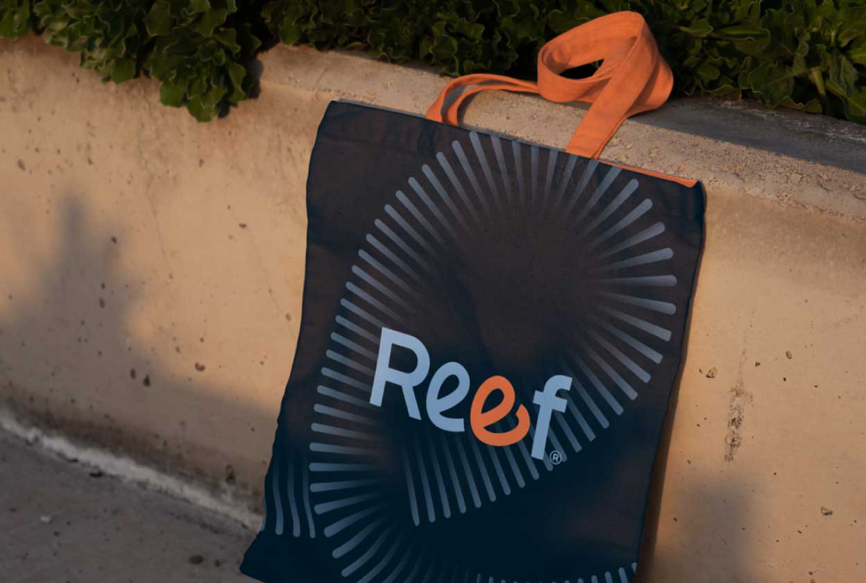
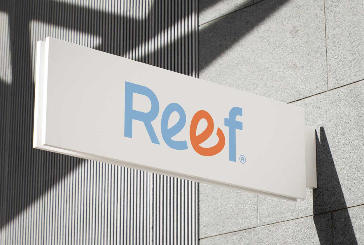
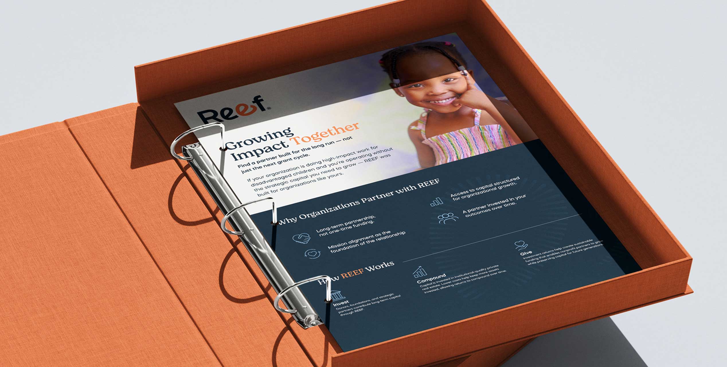
At the center of the identity is the REEF wordmark itself, where a small heart is built directly into the “e” — a quiet, permanent signal of the human intent behind every dollar deployed. It’s a detail that rewards a second look, much like the fund itself: institutional at a glance, personal on closer inspection.
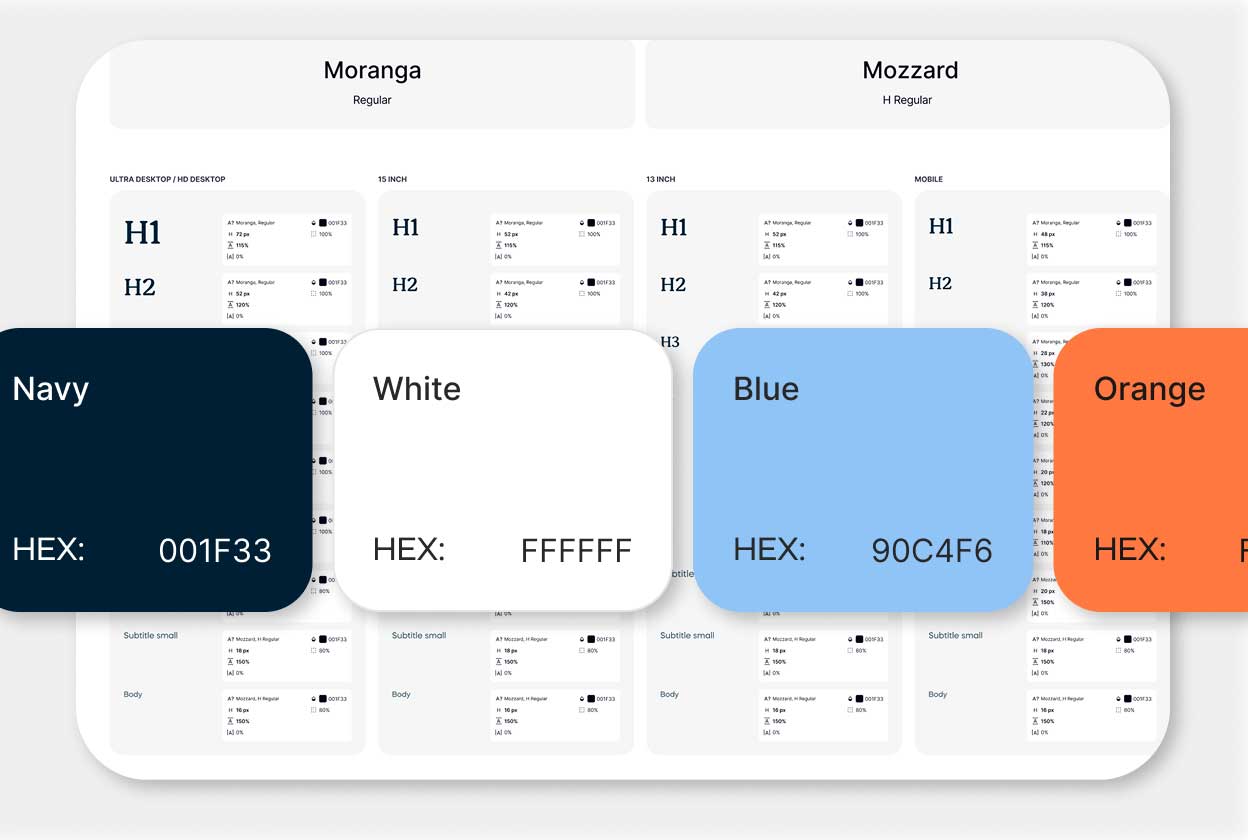
We paired a confident, rounded display face with a warmer serif for supporting copy, and built the palette around a sky blue and warm orange — colors that read as approachable and optimistic without tipping into a typical nonprofit or edtech look. Deep navy and clean white keep the system grounded and give the brand room to feel credible in a boardroom, not just a classroom.
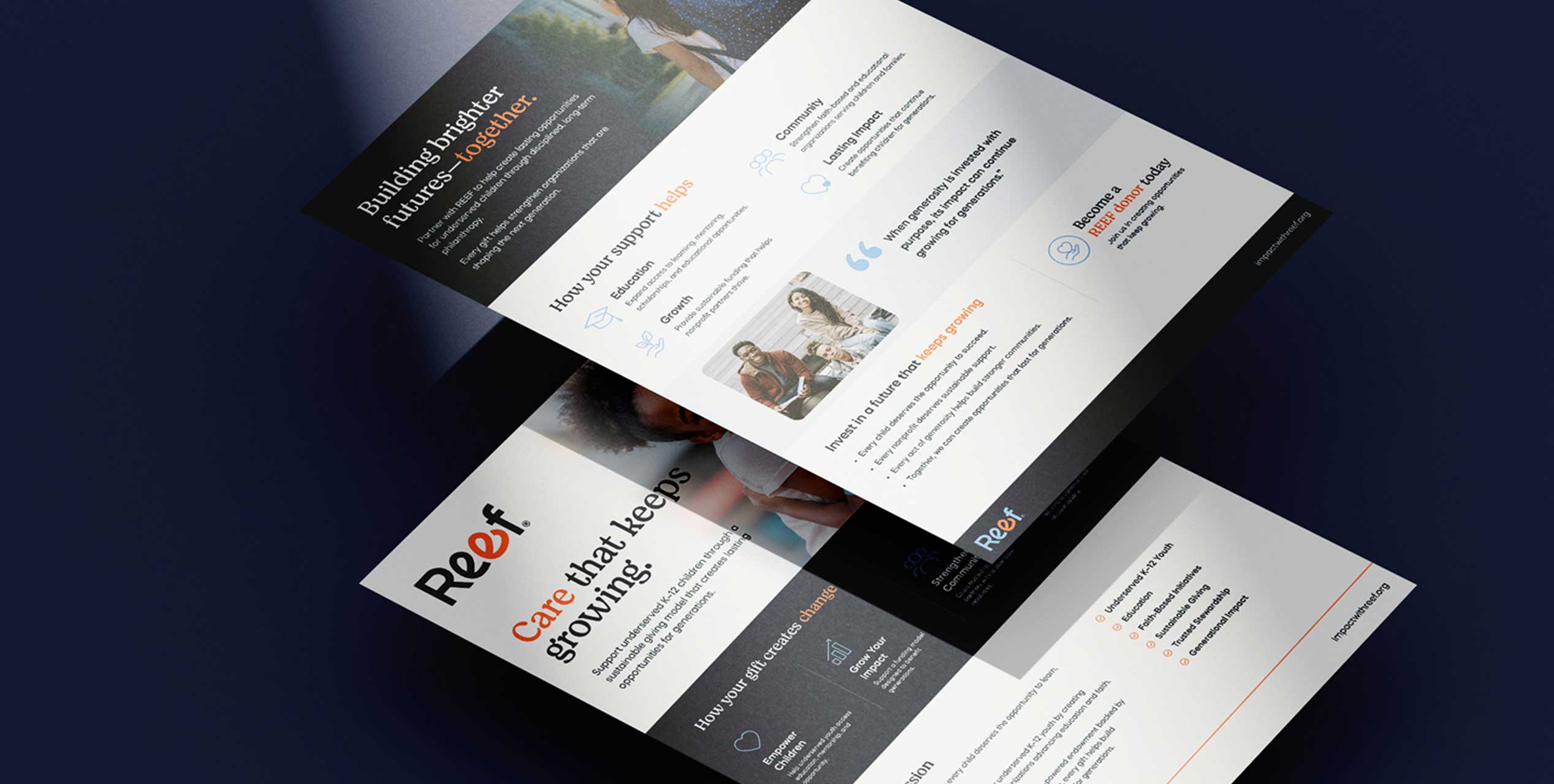
The result is a mark that works as hard on a pitch deck for institutional donors as it does on a tote bag or a classroom banner — one identity, fluent in two audiences.
Designing for Two Audiences, One Site
REEF’s website had to do something most nonprofit sites don’t: speak fluently to sophisticated donors evaluating a capital structure, and to nonprofit leaders evaluating a funding partner — often in the same visit.
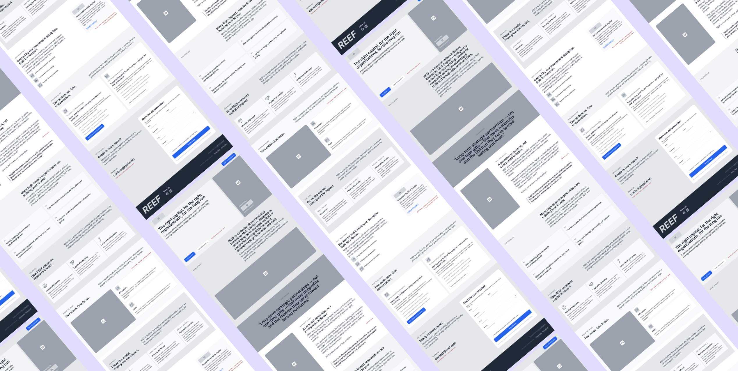
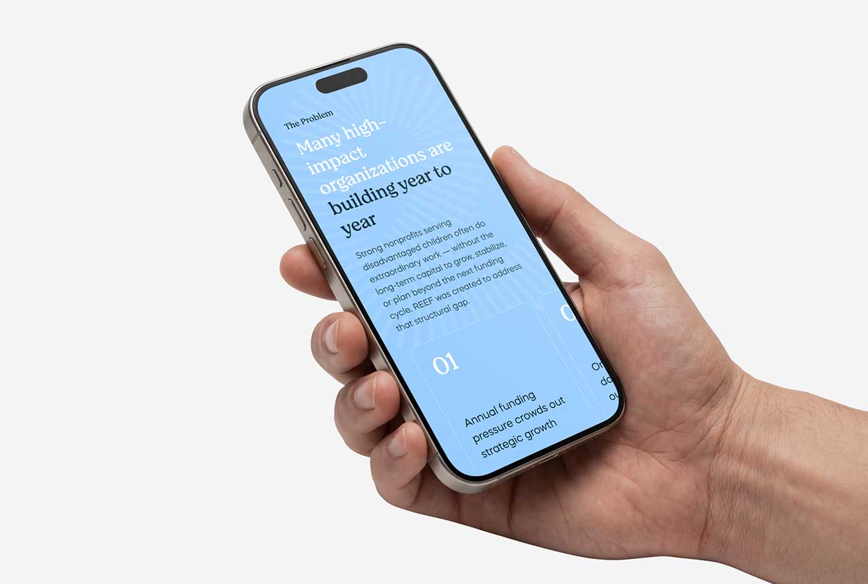
We structured the UX around that split. The site opens with REEF’s mission and model in plain terms, then earns the right to go deeper — walking visitors through the problem REEF solves, how the fund works, and the investment mechanics behind the compounding model, using clear data visualization to make the “power of compounding” tangible rather than abstract.
Rather than forcing every visitor down one path, the site resolves into two clear tracks — “For Donors & Philanthropists” and “For Nonprofits & Schools” — each with its own value proposition, proof points, and call to action, so a donor and a school administrator both leave knowing exactly what to do next.
Interface That Builds Trust
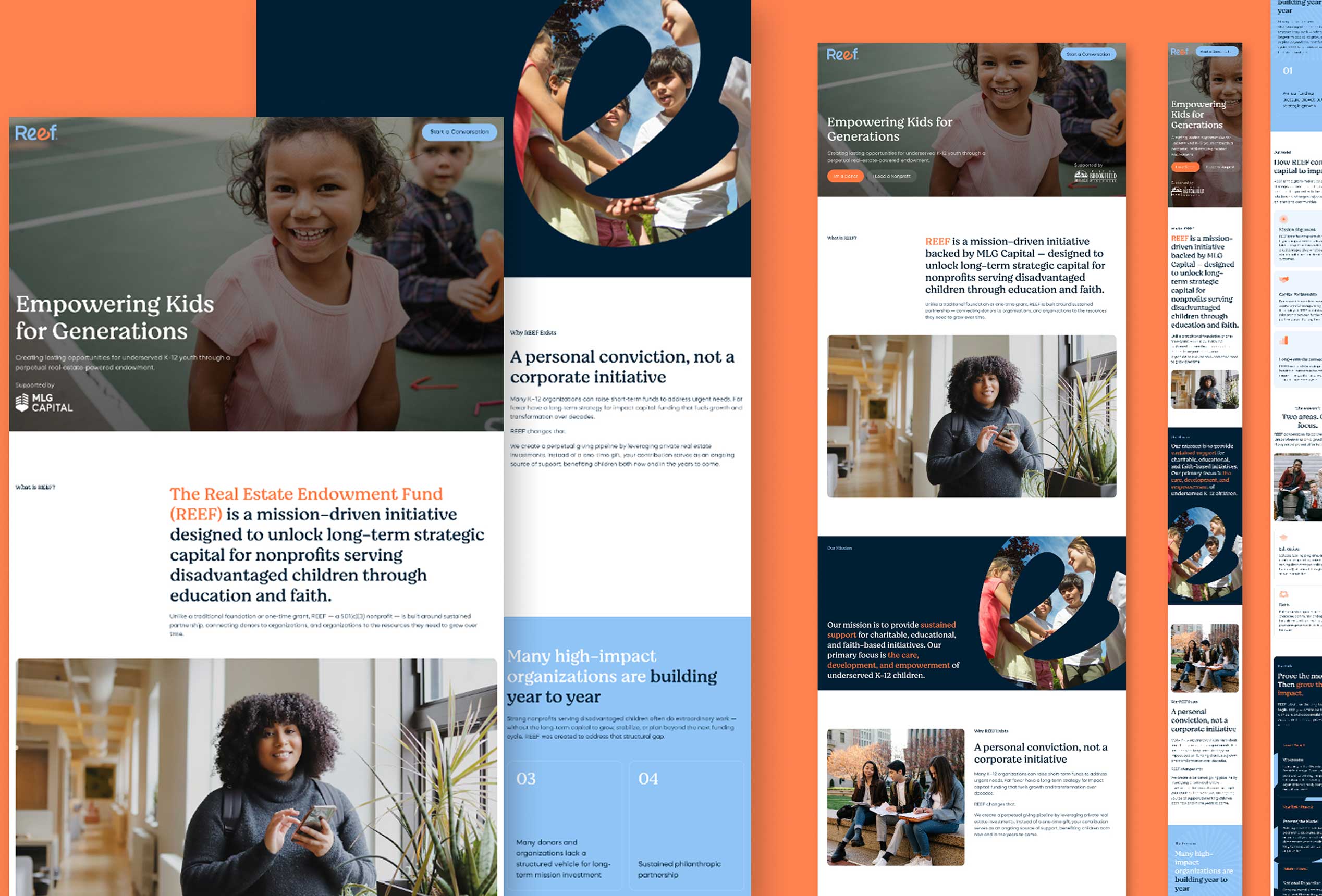
On the UI side, we leaned into REEF’s new visual language — warm photography of the children and communities REEF supports, set against clean, confident data presentation for the investment side of the story.
Every section was designed to move a visitor from emotional buy-in to financial confidence: mission and story up top, model and numbers as the visitor scrolls deeper. Custom components — the traditional-versus-REEF endowment comparison, the cost-savings breakdown, the “why trust REEF” credibility block — were built to make complex financial concepts scannable at a glance, without a donor ever needing a finance background to understand the upside.
Built and developed end-to-end by RPPL, the site gives REEF a digital home that matches the seriousness of the capital it manages and the warmth of the mission it serves.
A Brand Built to Compound
REEF now has an identity and a website that do more than describe the fund — they make its unusual model easy to understand and easy to trust, for donors weighing a long-term commitment and for nonprofits weighing a long-term partner.
From a single detail in a wordmark to a full donor-and-nonprofit digital experience, every piece was built around the same idea: that care, structured correctly, can keep growing for generations.