CS Art Partners
The Art of Advisory, Elevated
A premium, detail-driven identity and digital platform designed to express the sophistication and global perspective of CS Art Partners.

Crafted for Connoisseurs
Year
2024
Services
Brand Strategy
Brand Identity
Marketing Collateral
UX Design
UI Design
Web Development
Client
CS Art Partners
A Practice Defined by Discretion and Expertise
We developed a bespoke and intentionally reserved brand identity for CS Art Partners, an industry-leading art advisory practice guiding investors in building and expanding sustainably valuable collections.
Rooted in discretion, expertise, and global access, the brand distills the firm’s role into a clear visual and verbal language—elevated, confident, and quietly authoritative.
The logomark includes an alternative abbreviated format for use in small or discreet spaces, with a custom grid system providing both structure and rationale for the unique letter arrangement.
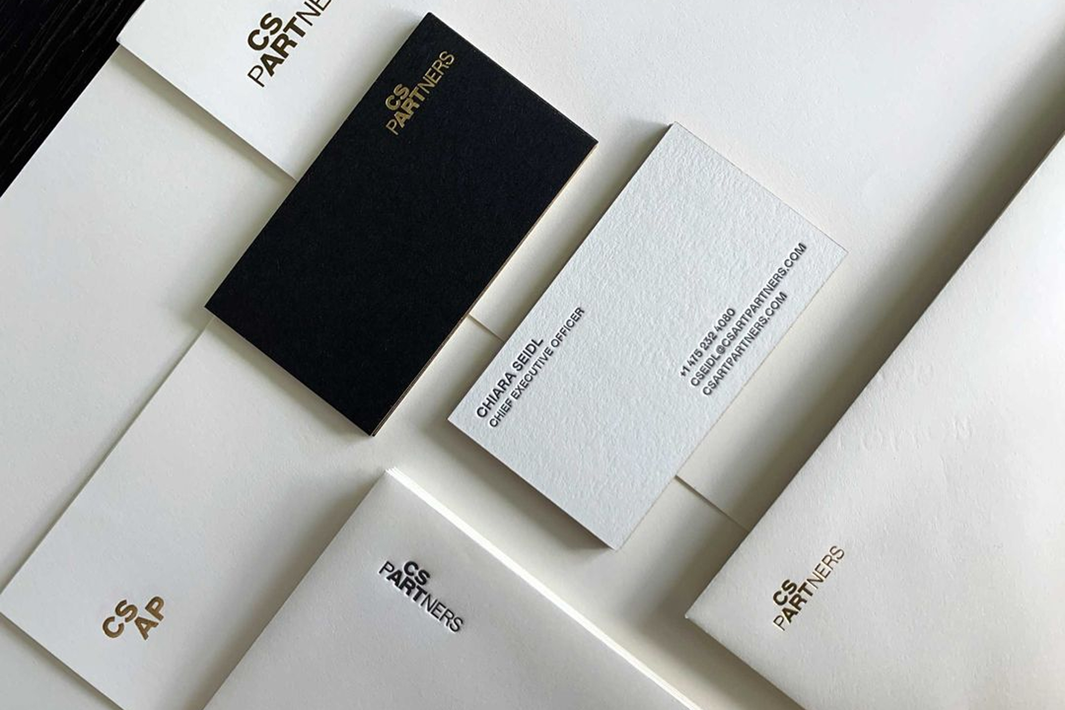

Craftsmanship as a Brand Signature
The brand extends into tactile, craft-driven applications that communicate the firm’s premium positioning.
Business cards feature a painted gold foil edge that echoes the logo’s gilded qualities, while a combination of foil, deboss, and letterpress printing techniques brings depth and dimension to the physical identity.
Letterhead continues this elevated approach with a debossed mark that reinforces the firm’s commitment to detail and craftsmanship.
Where Art and Investment Meet
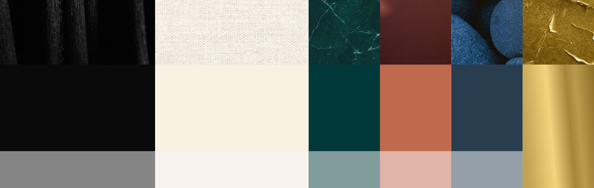
At the heart of the identity is the concept of Intersection—the convergence of art and investment, and the synergy created when these worlds align.
This idea informs the entire system, from the restrained color palette of Charcoal, Canvas, Marble, Terracotta, Stone, and Gold Leaf to the pairing of refined typography.
Fortescue, a serif with character and elegance, serves as the primary display type, while Mabry provides clarity and warmth for body copy. The logo stands apart with the exclusive use of FF Bau, giving the mark a distinctive and memorable presence.
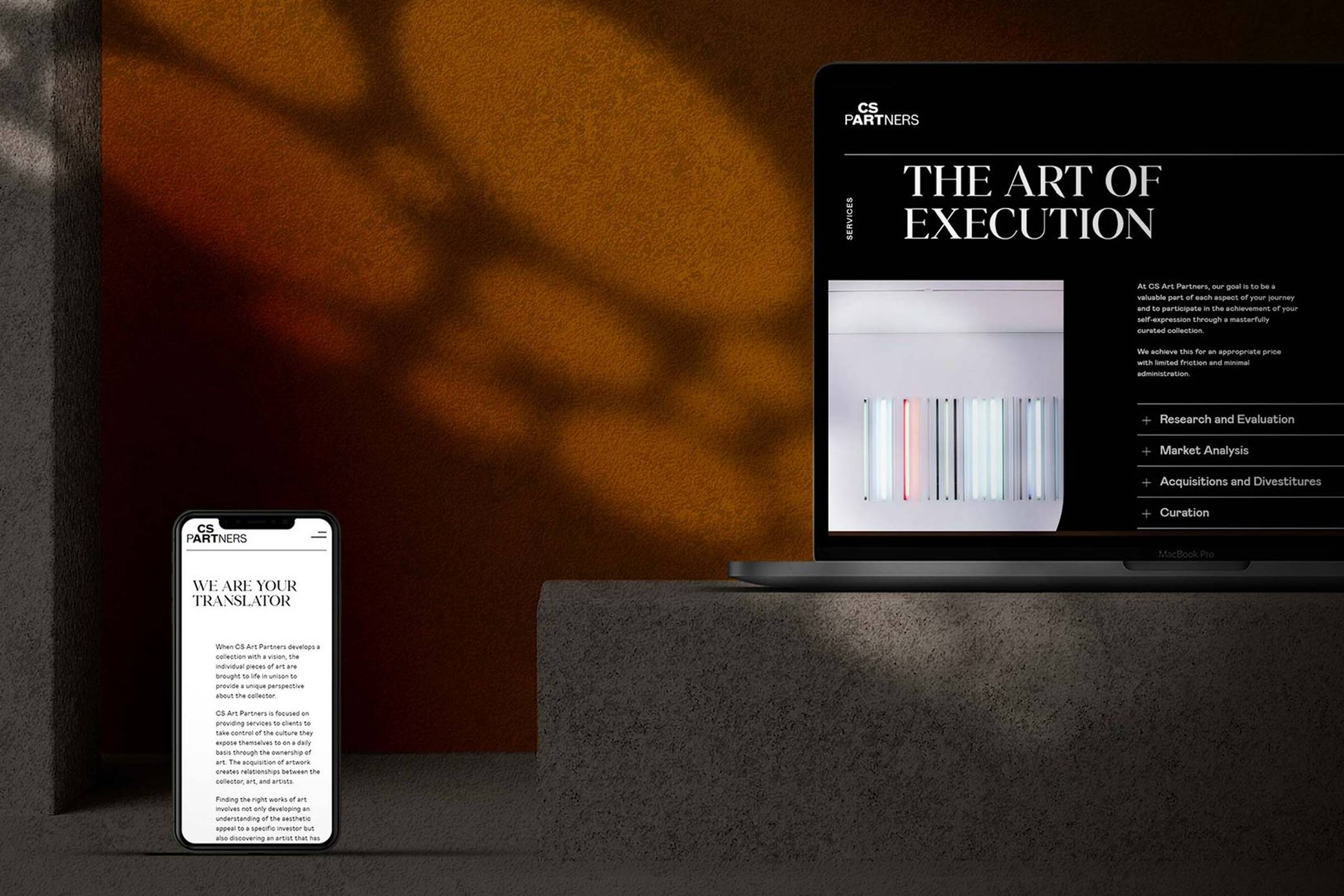
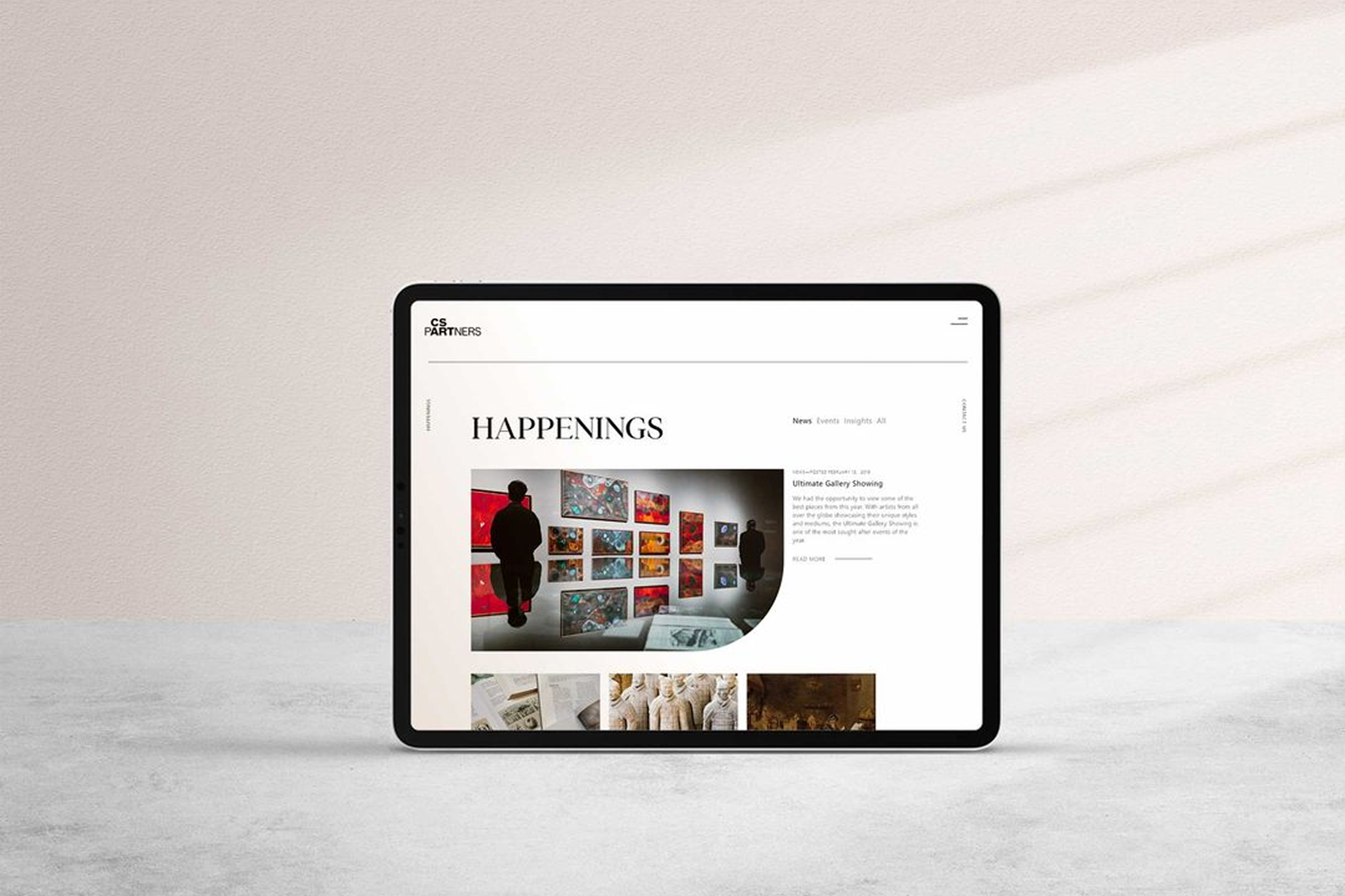
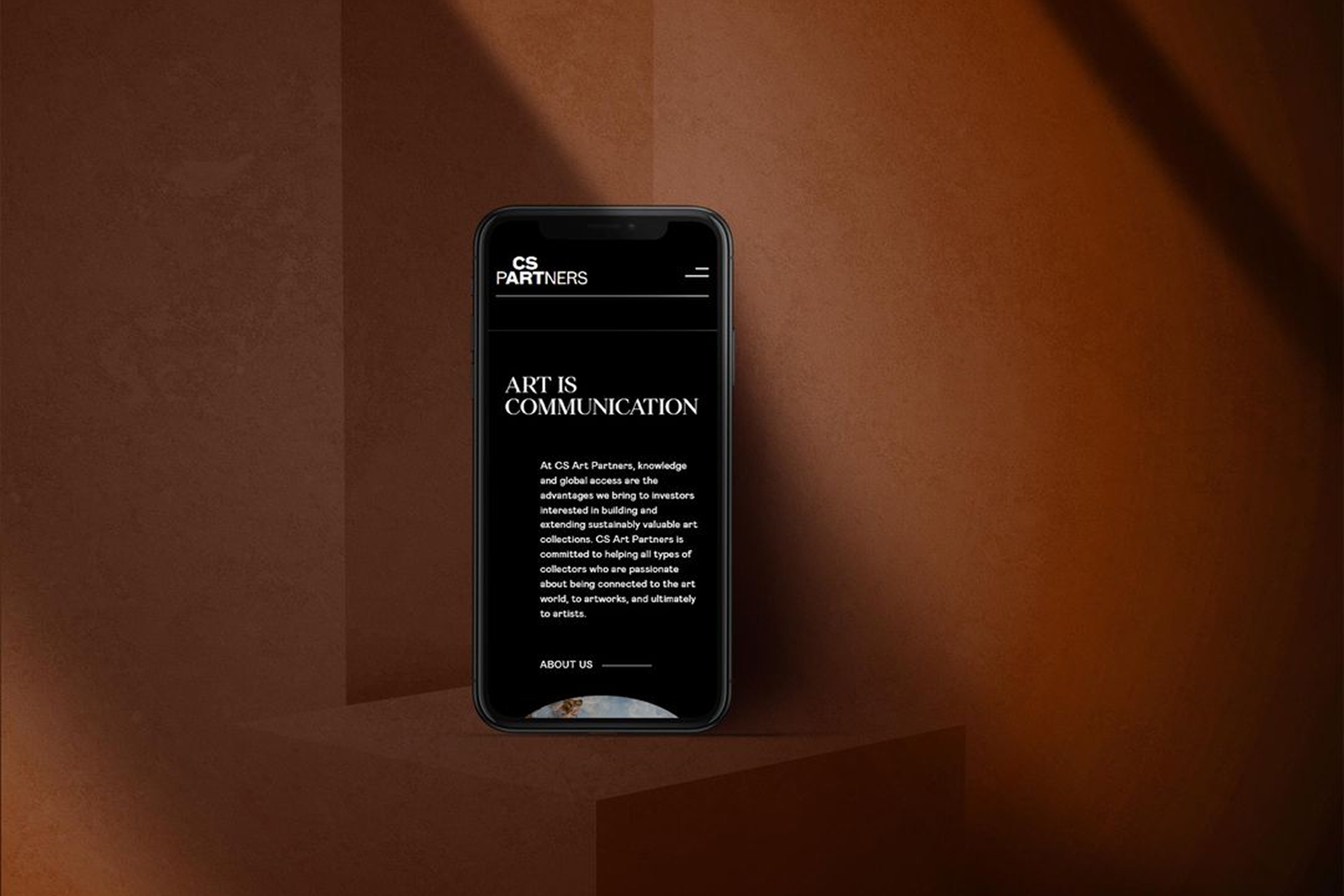
A Digital Experience Rooted in Clarity and Confidence
The brand comes to life online through a contemporary, intuitive website featuring a sticky header and contact button for seamless navigation. The homepage transitions from black-and-white to color, symbolizing clarity through expertise, while services are presented in expandable modules for easy exploration. News, Events, and Insights are organized for effortless browsing, and a streamlined Contact page ensures connecting with the firm is simple and refined.