Belmont Park Village

Belmont Park Village

Play

About

PROJECT
  • Brand: Belmont Park
  • Year: 2025
  • Industry: Retail & Lifestyle
  • Location: Worldwide
  • Link: belmontparkvillage.com
DELIVERABLES
  • Research & Discovery
  • UX Design
  • UI Design
  • Website Development
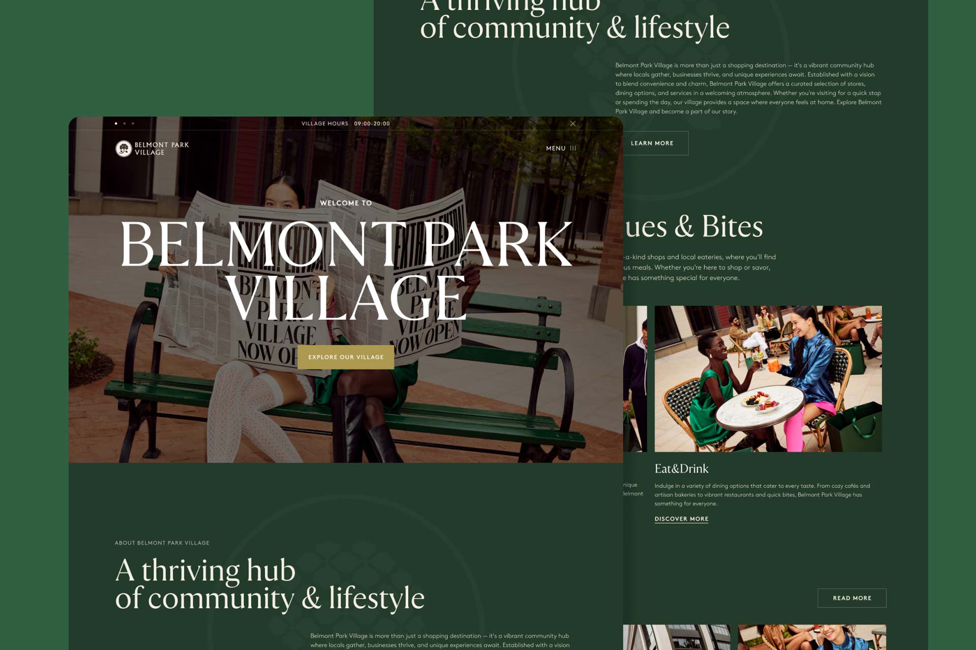
Belmont Park Village, the first North American destination of The Bicester Collection, offers designer fashion, dining, and world-class guest services.

Elevating a Luxury Brand Online

As the first North American destination in The Bicester Collection, Belmont Park Village required a digital experience that embodied the sophistication of one of the world’s leading luxury retail brands. The challenge was to translate the Village’s elevated in-person experience into a digital platform that could seamlessly guide visitors through a rich ecosystem of designer boutiques, dining, amenities, and services while maintaining the refined standards of the global collection.

Partnering closely with the Belmont Park Village team, we designed and developed a digital experience that balances clarity with elegance. A considered information architecture, intuitive user journeys, refined typography, and understated visual design create a seamless experience across every touchpoint. Fully responsive and accessible, the platform reinforces the Village’s premium positioning while making it effortless for visitors to explore, plan, and engage with the destination before they arrive.
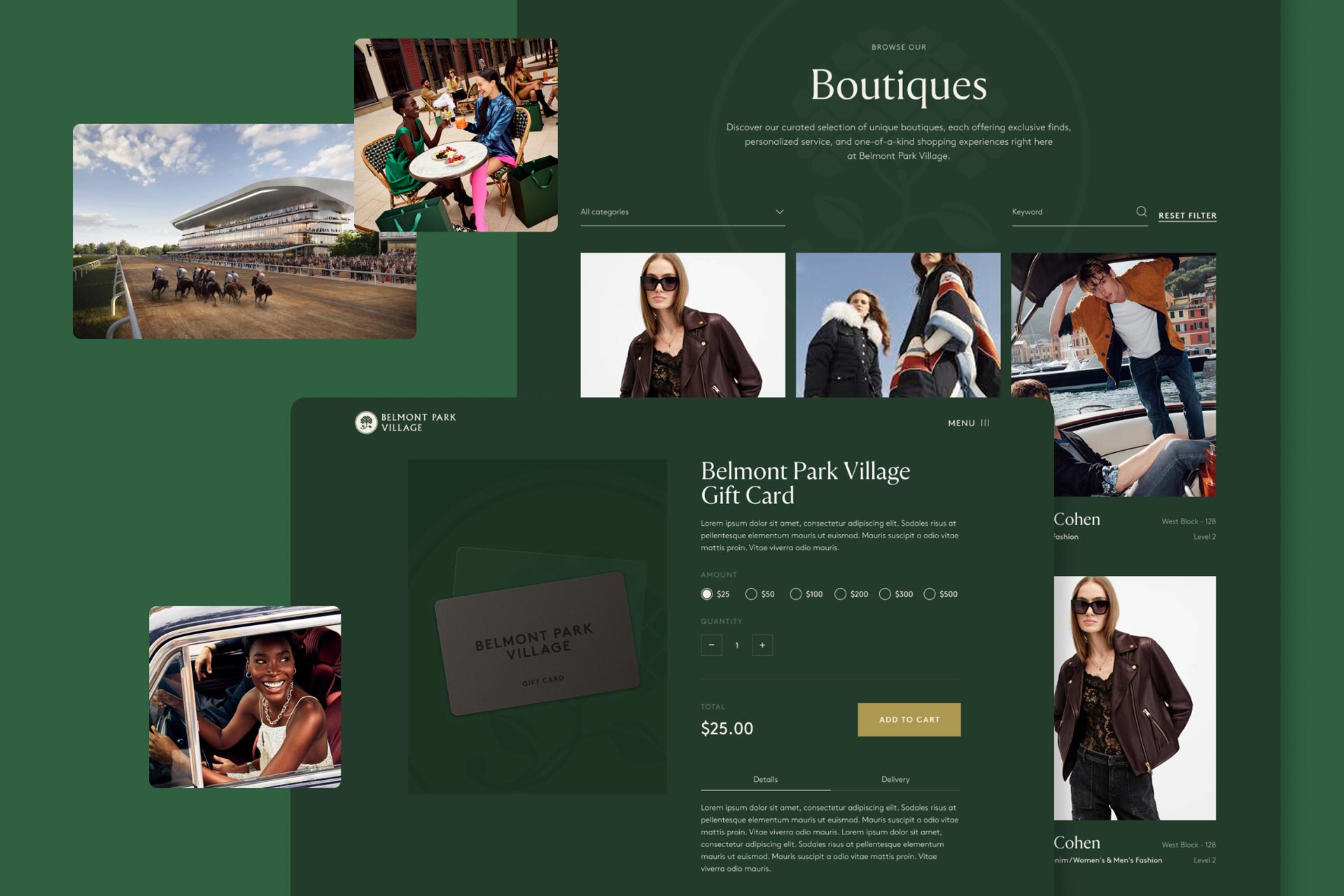
Guiding Visitors Seamlessly to Their Visit

With multiple access points – train, parking, shuttles, and proximity to UBS Arena – the biggest challenge was simplifying wayfinding. The redesigned site provides clear, user-friendly arrival information, interactive maps, and streamlined transportation guidance, reducing friction and helping guests plan their visit with confidence.
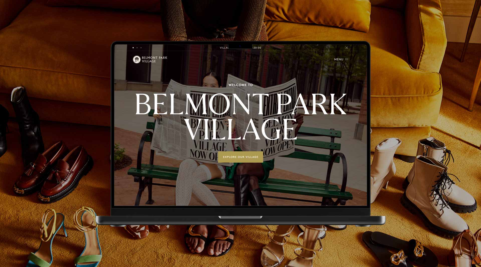
Clarifying a Complex Destination

Belmont Park Village offers shopping, dining, events, and world-class guest services – but communicating all of that clearly was a challenge. Through thoughtful UX architecture and intentional content hierarchy, the website distills a multi-layered destination into a clear, intuitive experience that helps visitors quickly understand what the Village offers.

Rechler Business District

Rechler Business District

Play

About

PROJECT
  • Brand: Rechler Equity Partners
  • Year: 2023
  • Industry: Real Estate
  • Location: Worldwide
  • Link: rechlerbusinessdistrict.com
DELIVERABLES
  • Brand Strategy
  • Brand Identity
  • UX Design
  • UI Design
  • Marketing Collateral
  • Interactive 3D
A dynamic digital experience designed to elevate a modern business district-bringing clarity, energy, and momentum to a growing hub for industry, innovation, and opportunity.

A Brand Built for Growth and Distinction

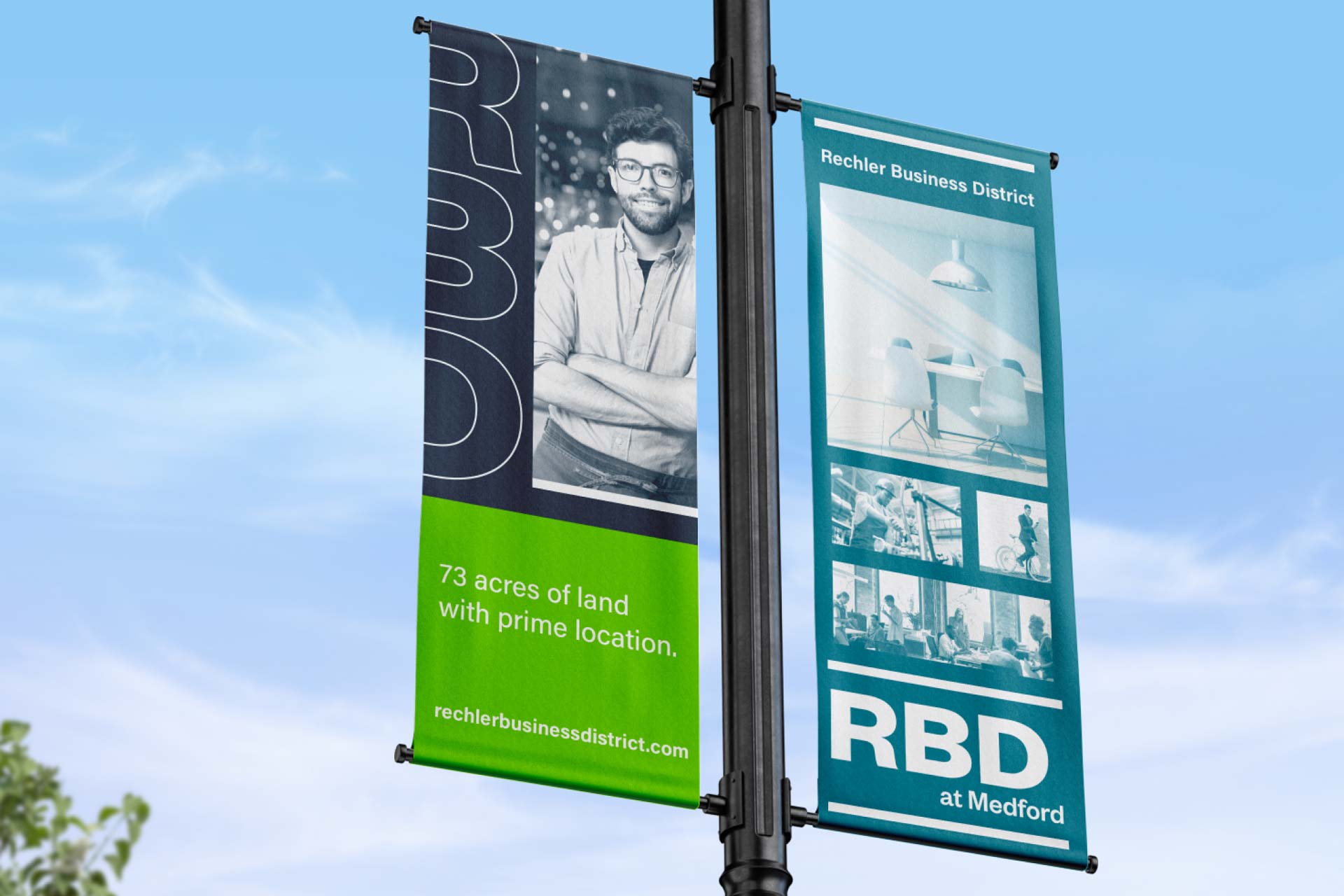
Rechler Business District (RBD) is a modern, adaptable business park in Medford, NY, developed by Long Island real estate leader Rechler Equity Partners. Spanning 73 acres, RBD offers flexible, high-quality spaces designed to attract developers, tenants, brokers, and business owners looking for opportunity and growth.

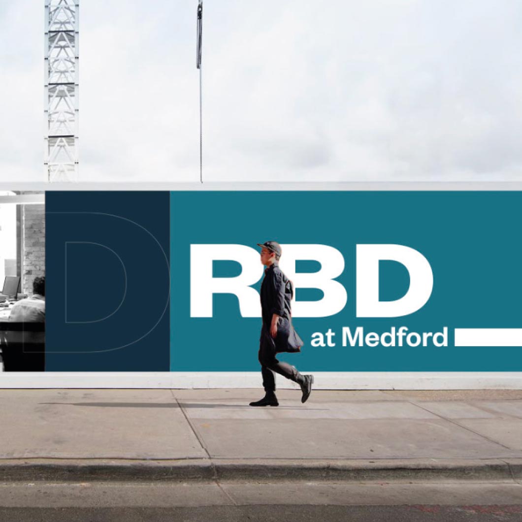
The brand builds on Rechler’s legacy while giving RBD its own bold, vibrant identity. Clean, modern visuals and a cohesive digital and physical experience showcase the community, energy, and long-term value of the new locationbringing the business park to life for everyone who interacts with it.

Brand Expression: Identity with Purpose

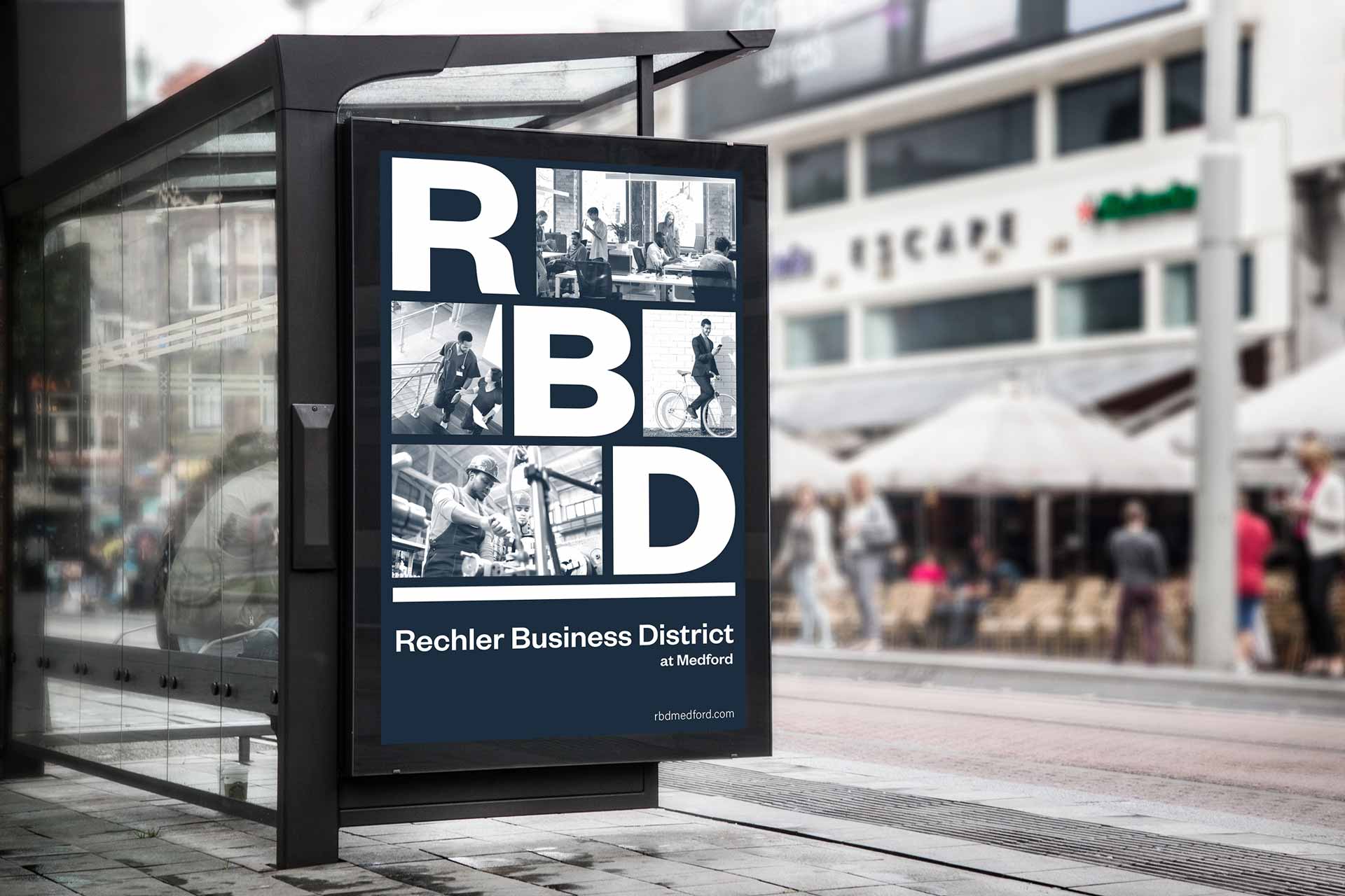
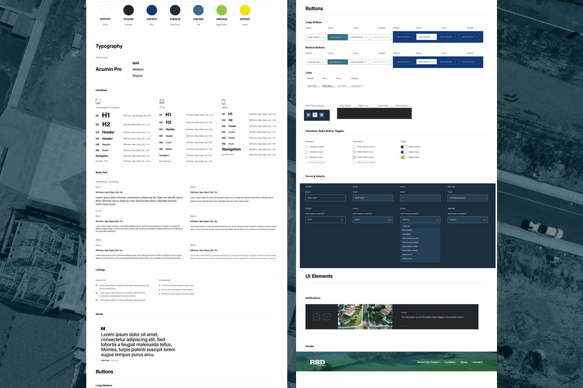
Rooted in the Rechler Equity Partners parent brand ecosystem, the visual identity system embraces bold contrasts, modern typography, and purposeful use of color and form. It reflects the project’s scale and ambition – bold enough to stand out in a competitive commercial real estate landscape, yet refined to convey sophistication and trust.

Brand elements are applied consistently across digital and marketing collateral, reinforcing RBD’s forward-looking positioning and appealing directly to the project’s target audiences: real estate brokers, developers, business owners, and industrial partners.

Web Experience: Interactive, lmmersive, Strategic

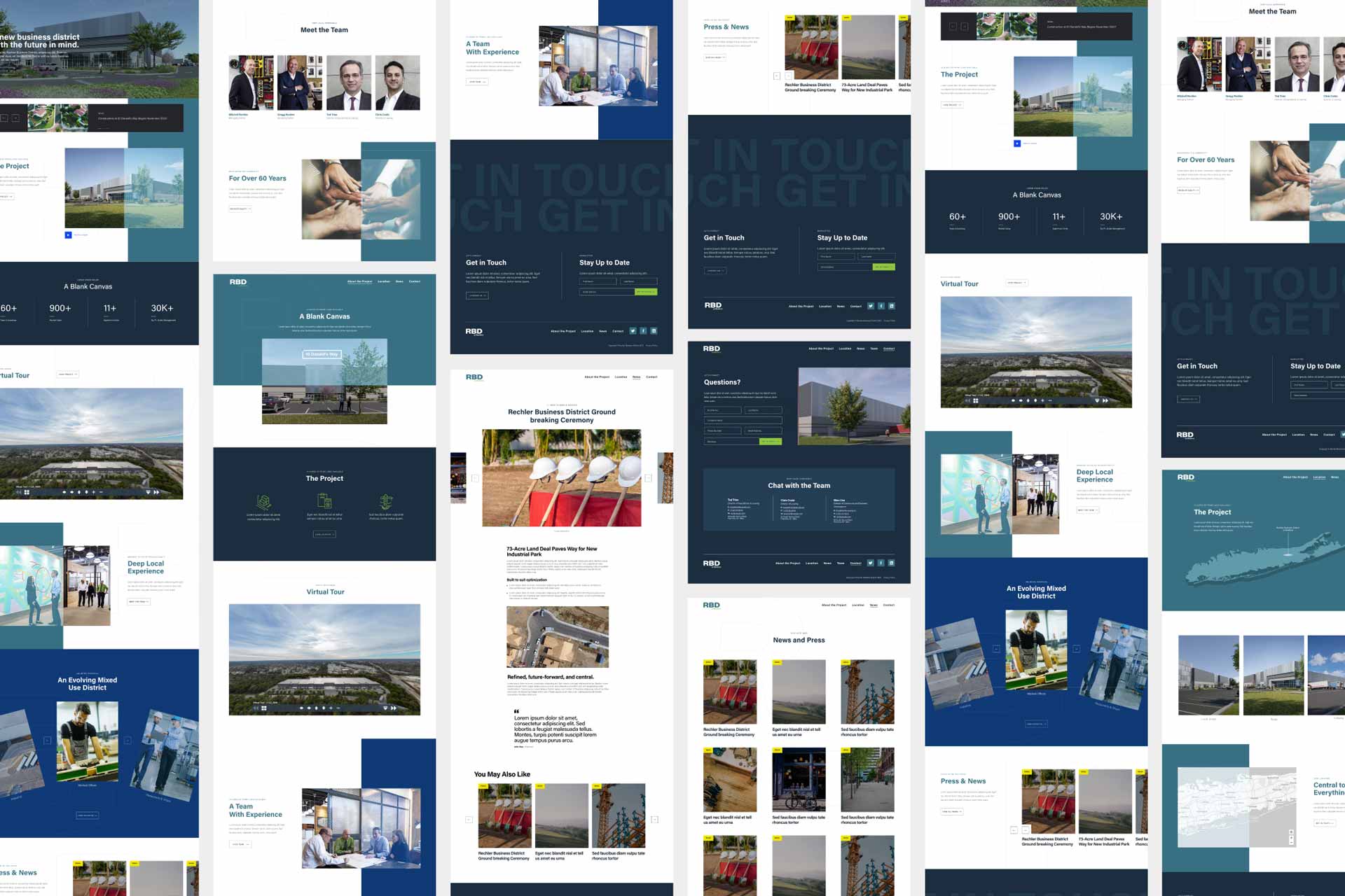
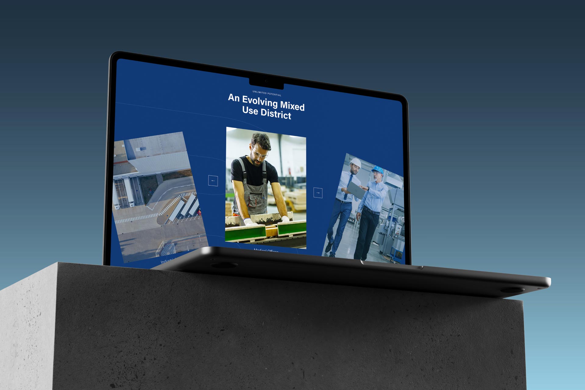
The Rechler Business District website serves as the central hub of the project’s digital presence. It is bold, clean, and modern – designed to speak to a professional and discerning audience while maximizing engagement and usability.

  • Custom 3D Renderings: High-impact visuals that bring the site and space to
    life.
  • Interactive 3D Tours: lmmersive walkthroughs to help prospects visualize the
    park, buildings, and future possibilities.
  • Dedicated Marketing Collateral: Easy access to brochures, site plans, and
    downloadable assets for brokers and tenants.
  • Built-for-Audience Navigation: Intuitive UX designed specifically for Realtors,
    developers, and business partners – providing clear paths to key information
    and inquiry actions.

The site’s information architecture supports swift decision-making, positioning
RBD not just as a place to lease space, but as a compelling business destination.

CS Art Partners

CS Art Partners

Play

About

PROJECT
  • Brand: CS Art Partners
  • Year: 2024
  • Industry: Art Consultancy
  • Location: Worldwide
  • Link: csartpartners.com
DELIVERABLES
  • Research & Discovery
  • Brand Strategy
  • Brand Identity
  • Marketing Collateral
  • UX Design
  • UI Design
  • Website Development
A premium, detail-driven identity and digital platform designed to express the sophistication and global perspective of CS Art Partners.

A Practice Defined by Discretion and Expertise

We developed a bespoke and intentionally reserved brand identity for CS Art Partners, an industry-leading art advisory practice guiding investors in building and expanding sustainably valuable collections.

Rooted in discretion, expertise, and global access, the brand distills the firm’s role into a clear visual and verbal language-elevated, confident, and quietly authoritative.

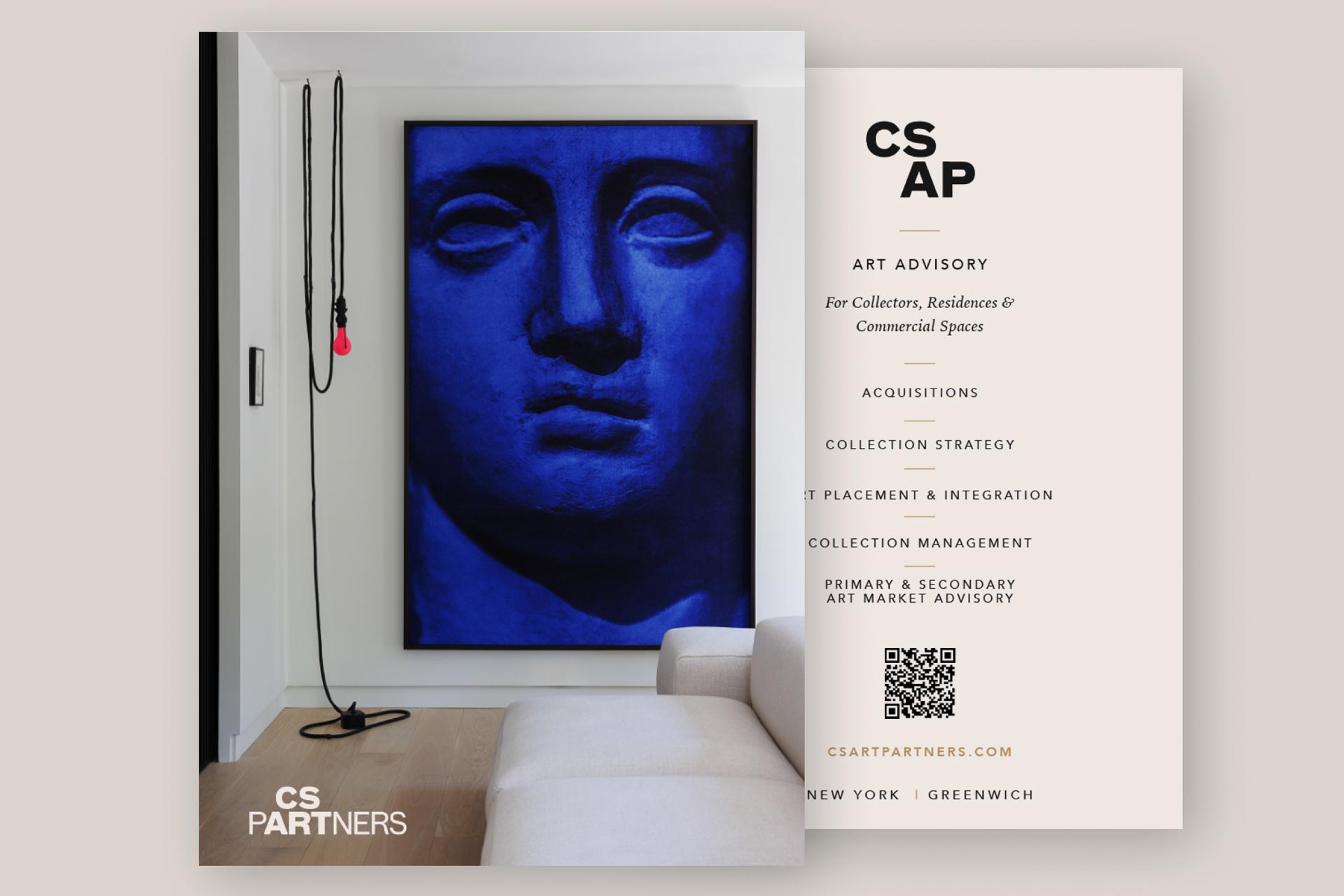
The logomark includes an alternative abbreviated format for use in small or discreet spaces, with a custom grid system providing both structure and rationale for the unique letter arrangement.

Craftsmanship as a Brand Signature

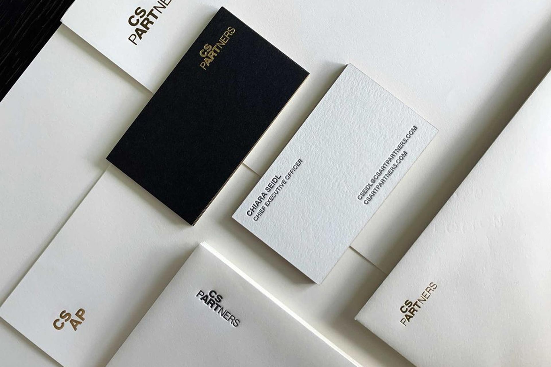
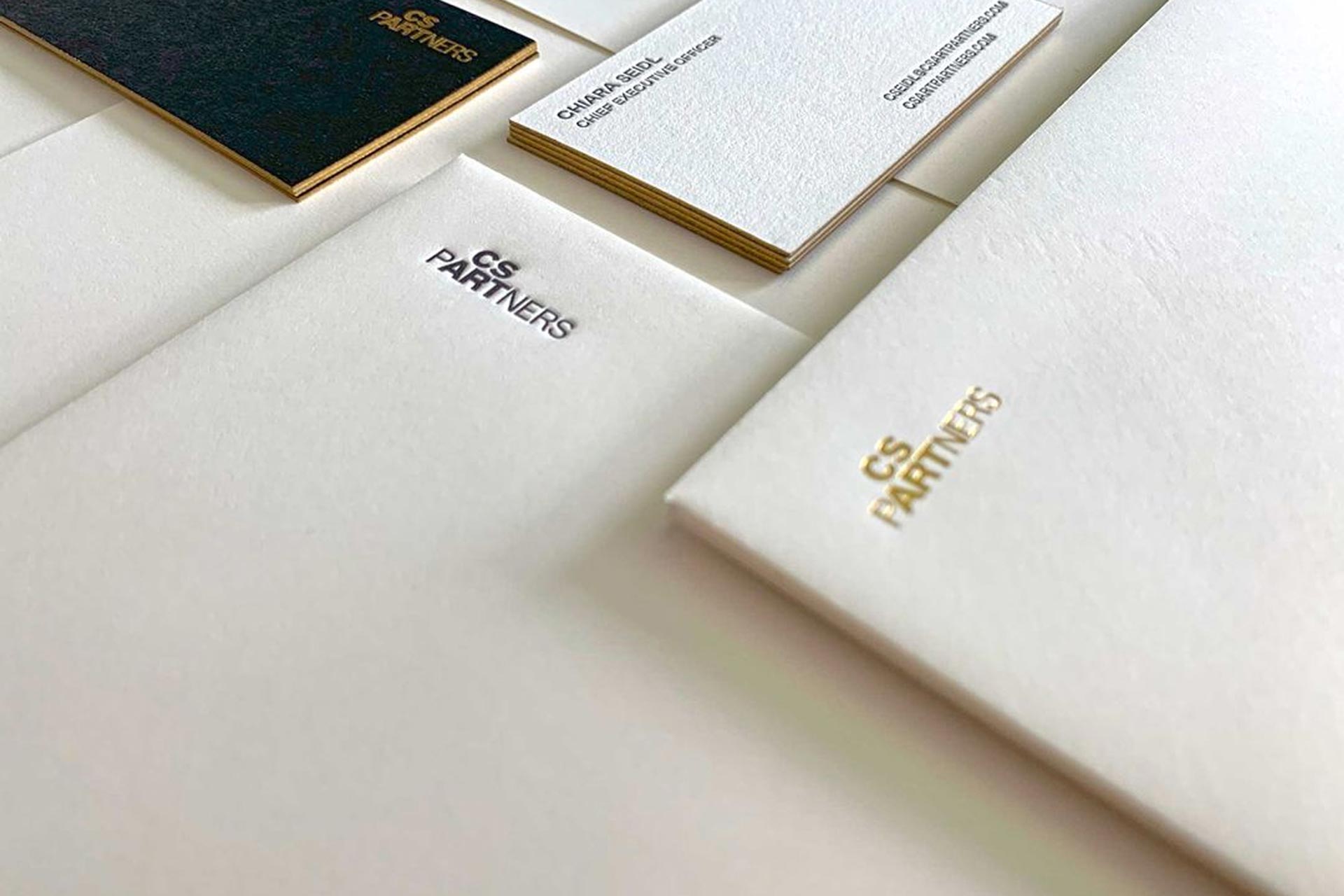
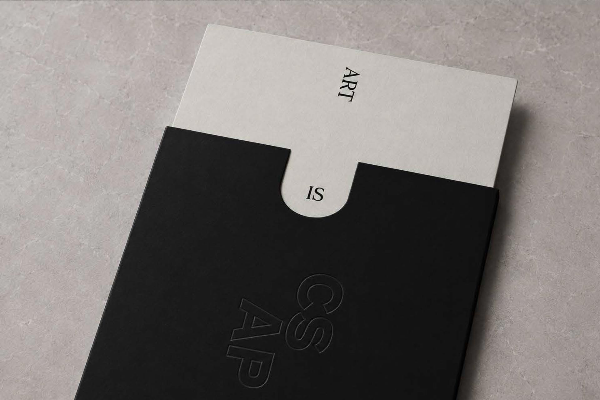
The brand extends into tactile, craft-driven applications that communicate the firm’s premium positioning. Business cards feature a painted gold foil edge that echoes the logo’s gilded qualities, while a combination of foil, deboss, and letterpress printing techniques brings depth and dimension to the physical identity.

Letterhead continues this elevated approach with a debossed mark that reinforces the firm’s commitment to detail and craftsmanship.

Where Art and Investment Meet

At the heart of the identity is the concept of lntersection—the convergence of art and investment, and the synergy created when these worlds align.

This idea informs the entire system, from the restrained color palette of Charcoal, Canvas, Marble, Terracotta, Stone, and Gold Leaf to the pairing of refined typography.

Fortescue, a serif with character and elegance, serves as the primary display type, while Mabry provides clarity and warmth for body copy. The logo stands apart with the exclusive use of FF Bau, giving the mark a distinctive and memorable presence.

A Digital Experience Rooted in Clarity and Confidence

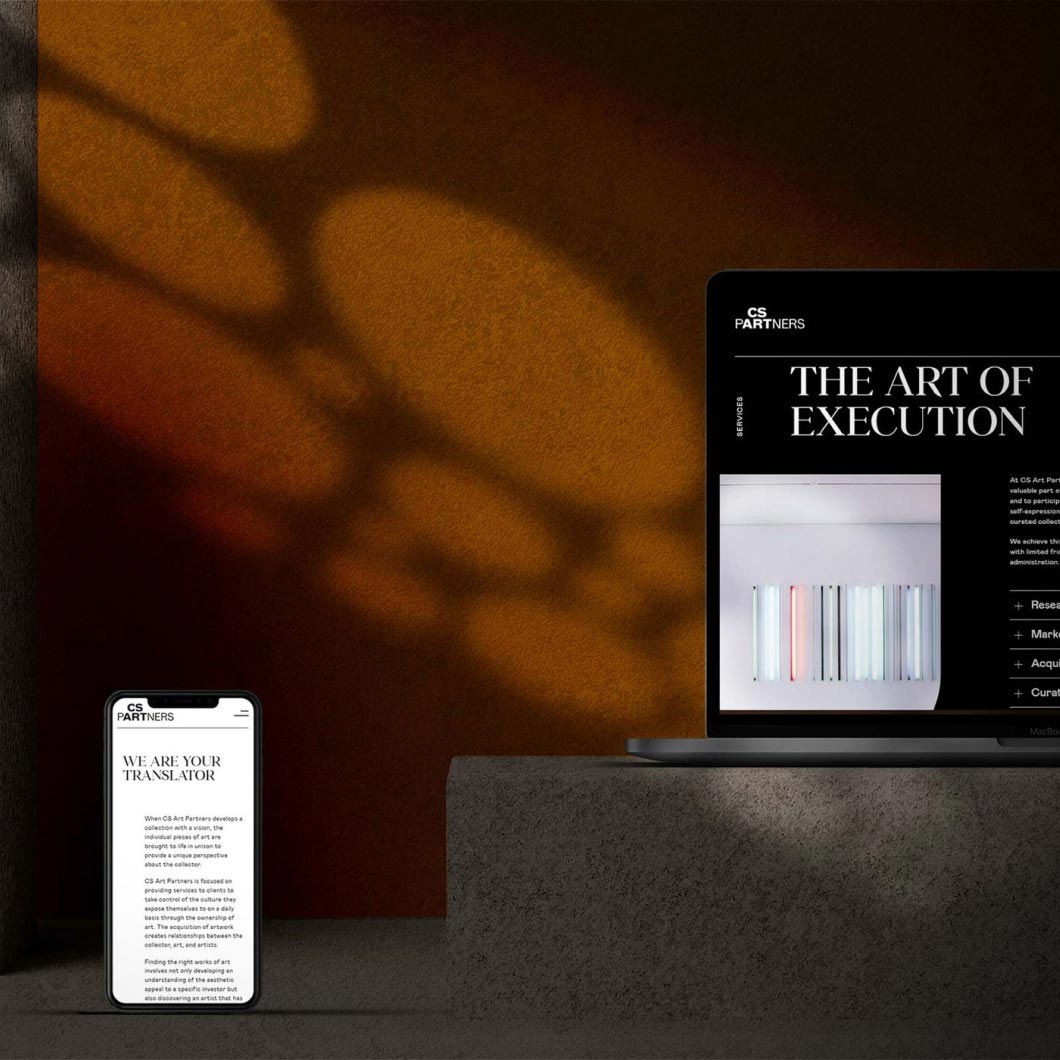
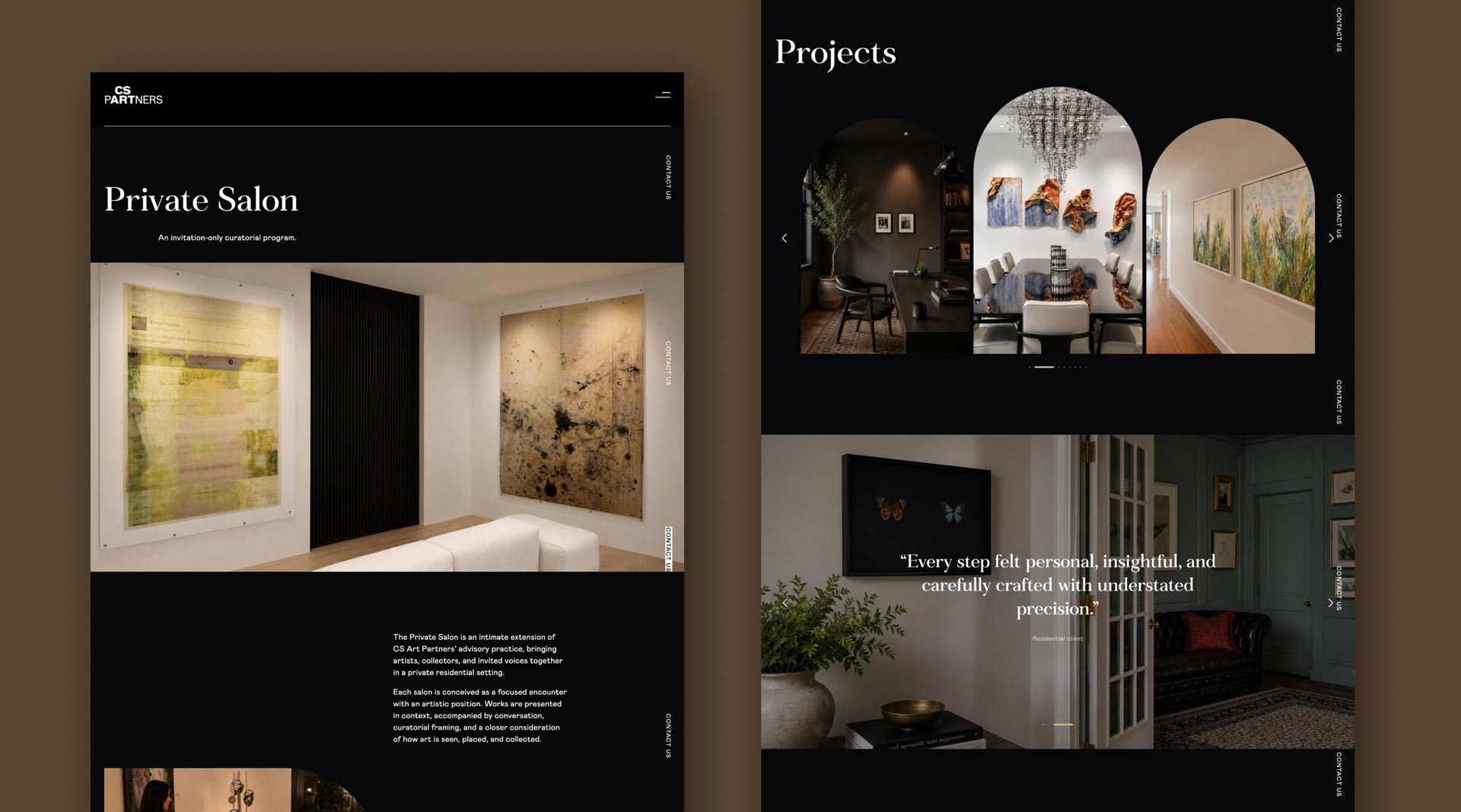
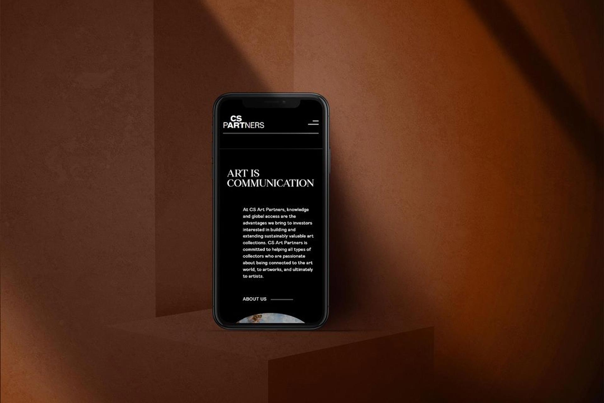
The brand comes to life online through a contemporary, intuitive website featuring a sticky header and contact button for seamless navigation.

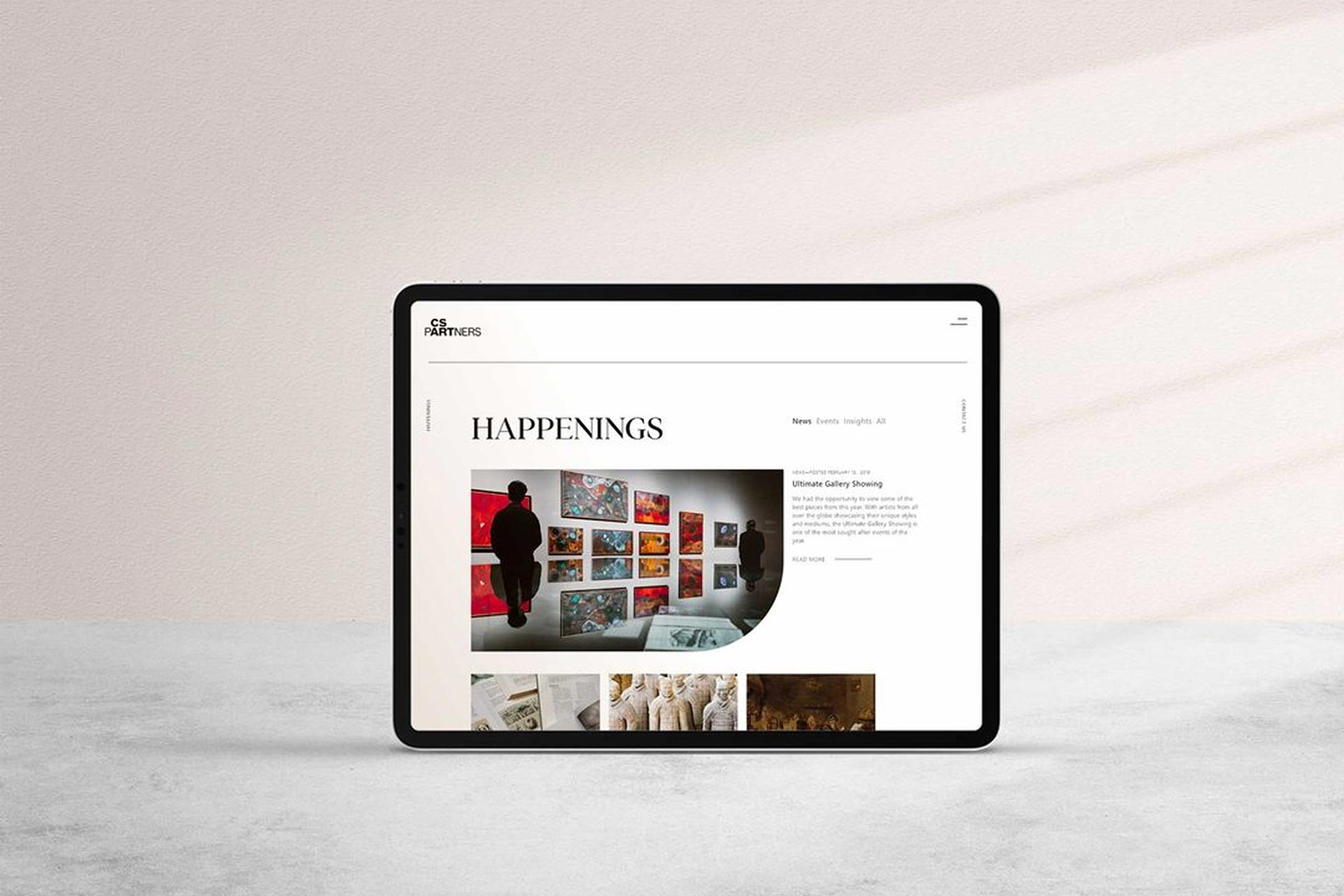
The homepage transitions from black-and-white to color, symbolizing clarity through expertise, while services are presented in expandable modules for easy exploration. News, Events, and Insights are organized for effortless browsing, and a streamlined Contact page ensures connecting with the firm is simple and refined.