Rechler Business District

Rechler Business District

Play

About

PROJECT
  • Brand: Rechler Equity Partners
  • Year: 2023
  • Industry: Real Estate
  • Location: Long Island, New York, USA
  • Link:

    rechlerbusinessdistrict.com

DELIVERABLES
  • Brand Strategy
  • Brand Identity
  • UX Design
  • UI Design
  • Marketing Collateral
  • Interactive 3D
A dynamic digital experience designed to elevate a modern business district-bringing clarity, energy, and momentum to a growing hub for industry, innovation, and opportunity.

A Brand Built for Growth and Distinction

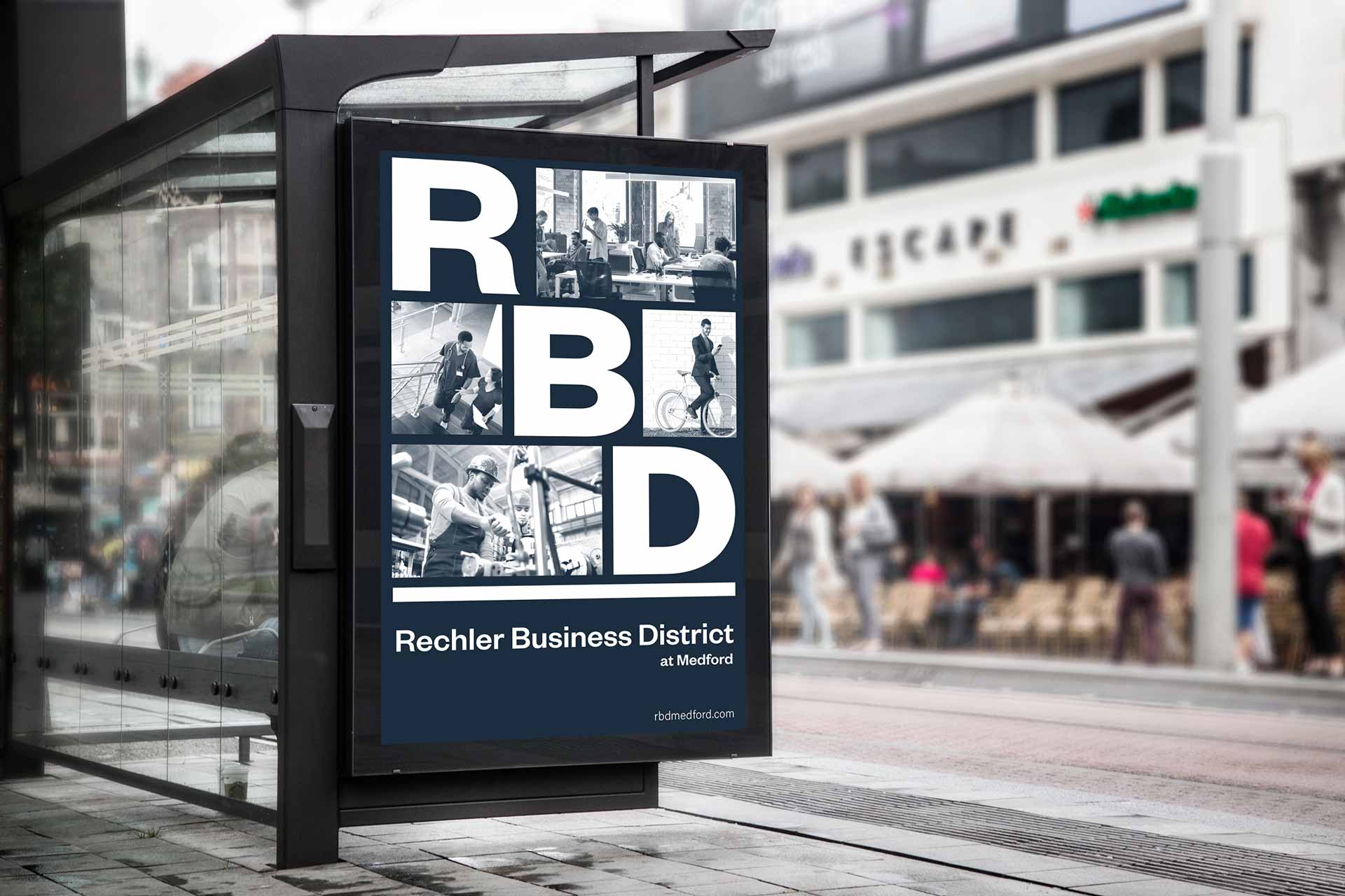
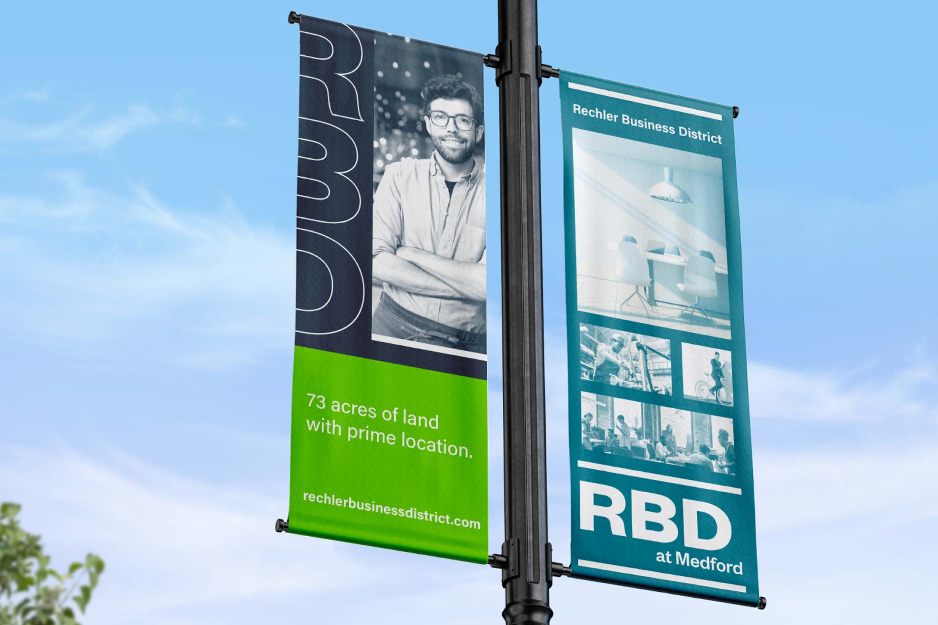
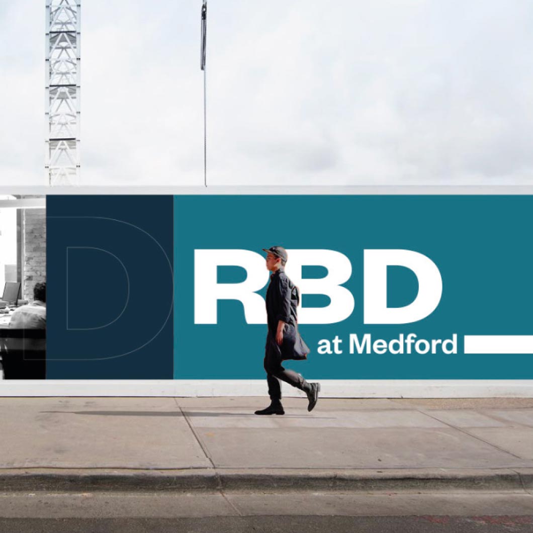
Rechler Business District (RBD) is a modern, adaptable business park in Medford, NY, developed by Long Island real estate leader Rechler Equity Partners. Spanning 73 acres, RBD offers flexible, high-quality spaces designed to attract developers, tenants, brokers, and business owners looking for opportunity and growth.

The brand builds on Rechler’s legacy while giving RBD its own bold, vibrant identity. Clean, modern visuals and a cohesive digital and physical experience showcase the community, energy, and long-term value of the new locationbringing the business park to life for everyone who interacts with it.
Brand Expression: Identity with Purpose

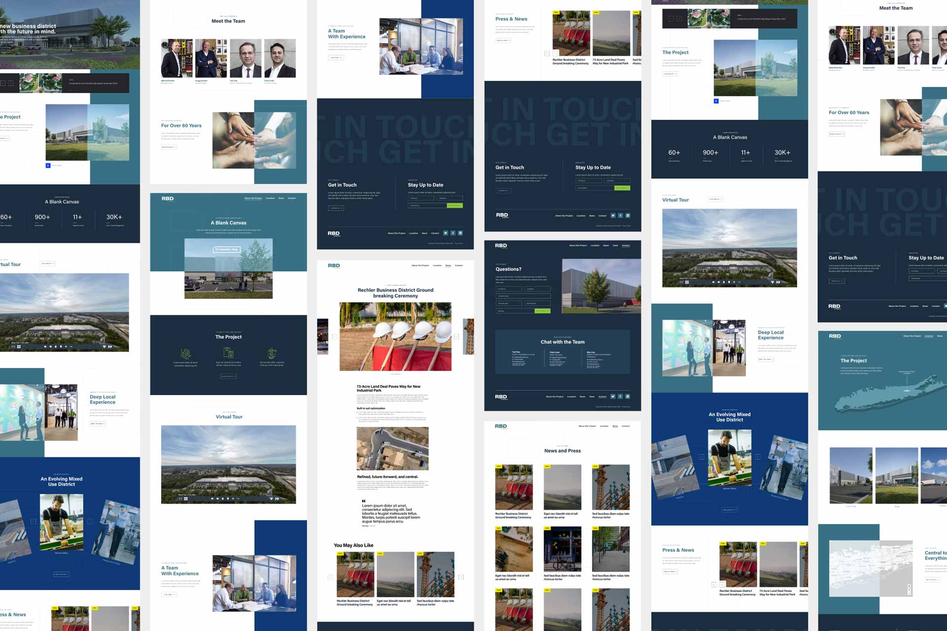
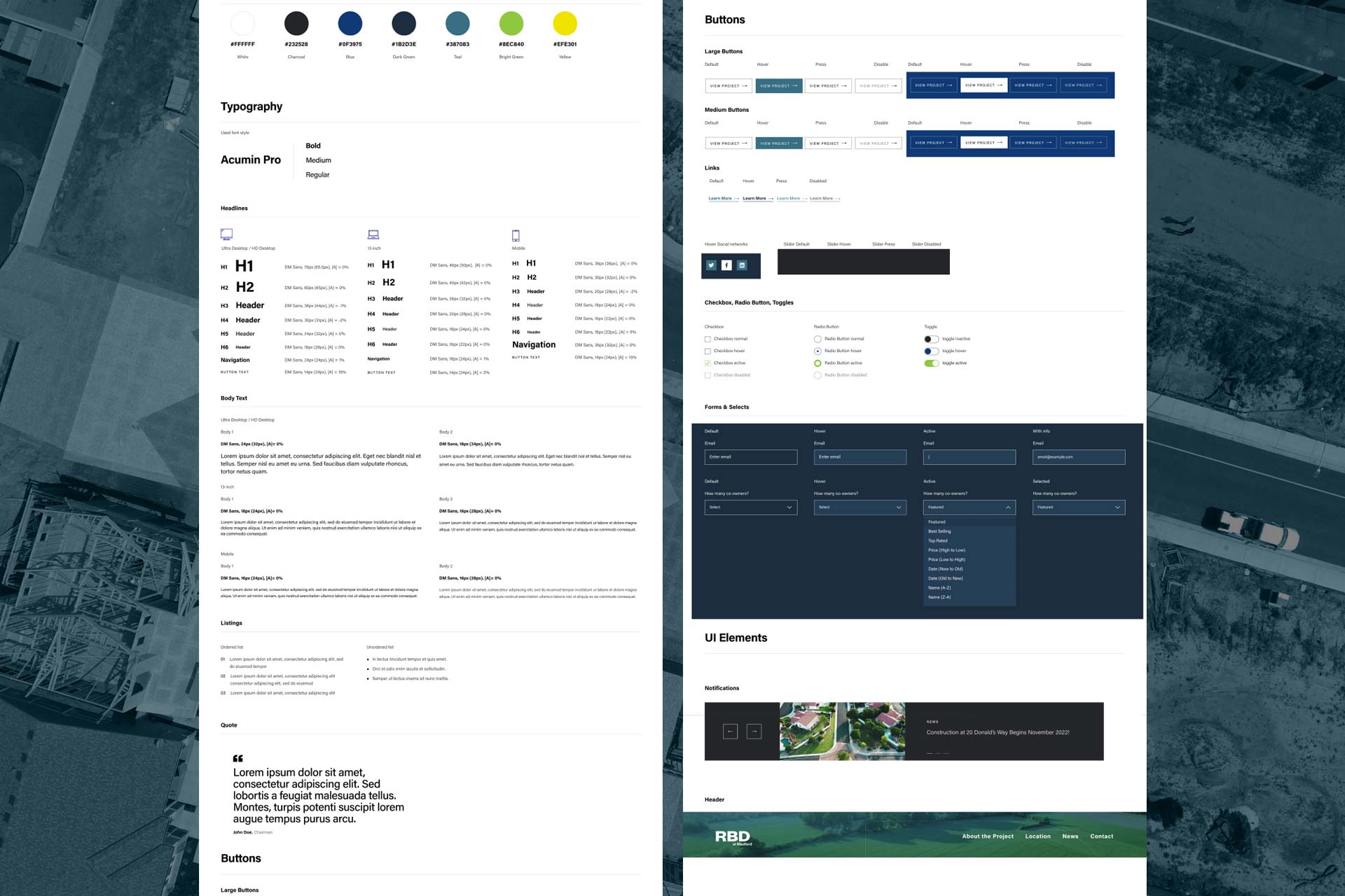
Rooted in the Rechler Equity Partners parent brand ecosystem, the visual identity system embraces bold contrasts, modern typography, and purposeful use of color and form. It reflects the project’s scale and ambition – bold enough to stand out in a competitive commercial real estate landscape, yet refined to convey sophistication and trust.

Brand elements are applied consistently across digital and marketing collateral, reinforcing RBD’s forward-looking positioning and appealing directly to the project’s target audiences: real estate brokers, developers, business owners, and industrial partners.
Web Experience: Interactive, lmmersive, Strategic

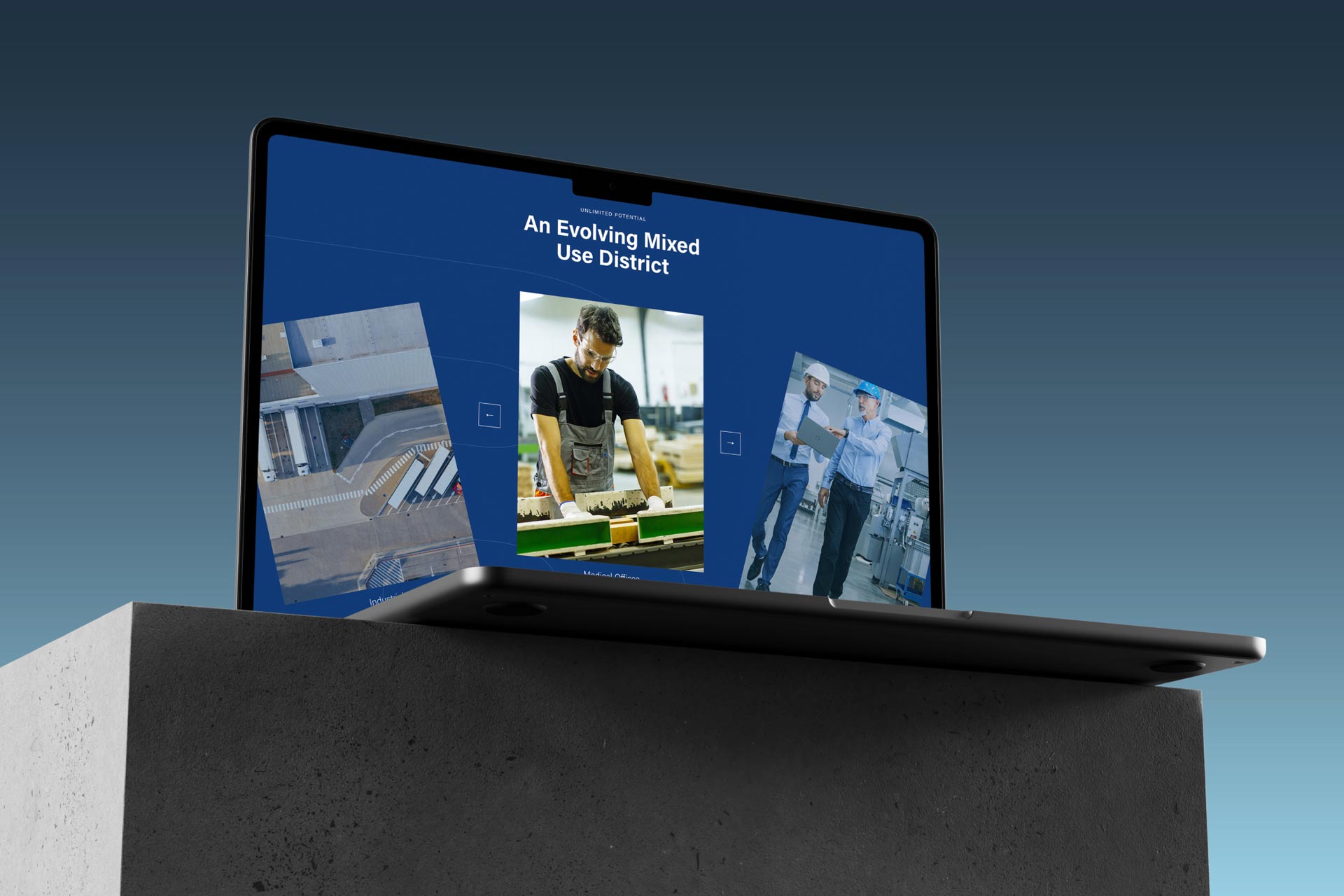
The Rechler Business District website serves as the central hub of the project’s digital presence. It is bold, clean, and modern – designed to speak to a professional and discerning audience while maximizing engagement and usability.

  • Custom 3D Renderings: High-impact visuals that bring the site and space to
    life.
  • Interactive 3D Tours: lmmersive walkthroughs to help prospects visualize the
    park, buildings, and future possibilities.
  • Dedicated Marketing Collateral: Easy access to brochures, site plans, and
    downloadable assets for brokers and tenants.
  • Built-for-Audience Navigation: Intuitive UX designed specifically for Realtors,
    developers, and business partners – providing clear paths to key information
    and inquiry actions.

The site’s information architecture supports swift decision-making, positioning
RBD not just as a place to lease space, but as a compelling business destination.

CS Art Partners

CS Art Partners

About

PROJECT
  • Brand: CS Art Partners
  • Year: 2024–Present (ongoing)
  • Industry: Art Consultancy
  • Location: Worldwide
  • Link:

    csartpartners.com

DELIVERABLES
  • Research & Discovery
  • Brand Strategy
  • Brand Identity
  • Marketing Collateral
  • UX Design
  • UI Design
  • Website Development
A premium, detail-driven identity and digital platform designed to express the sophistication and global perspective of CS Art Partners.

A Practice Defined by Discretion and Expertise

We developed a bespoke and intentionally reserved brand identity for CS Art Partners, an industry-leading art advisory practice guiding investors in building and expanding sustainably valuable collections.

Rooted in discretion, expertise, and global access, the brand distills the firm’s role into a clear visual and verbal language-elevated, confident, and quietly authoritative.

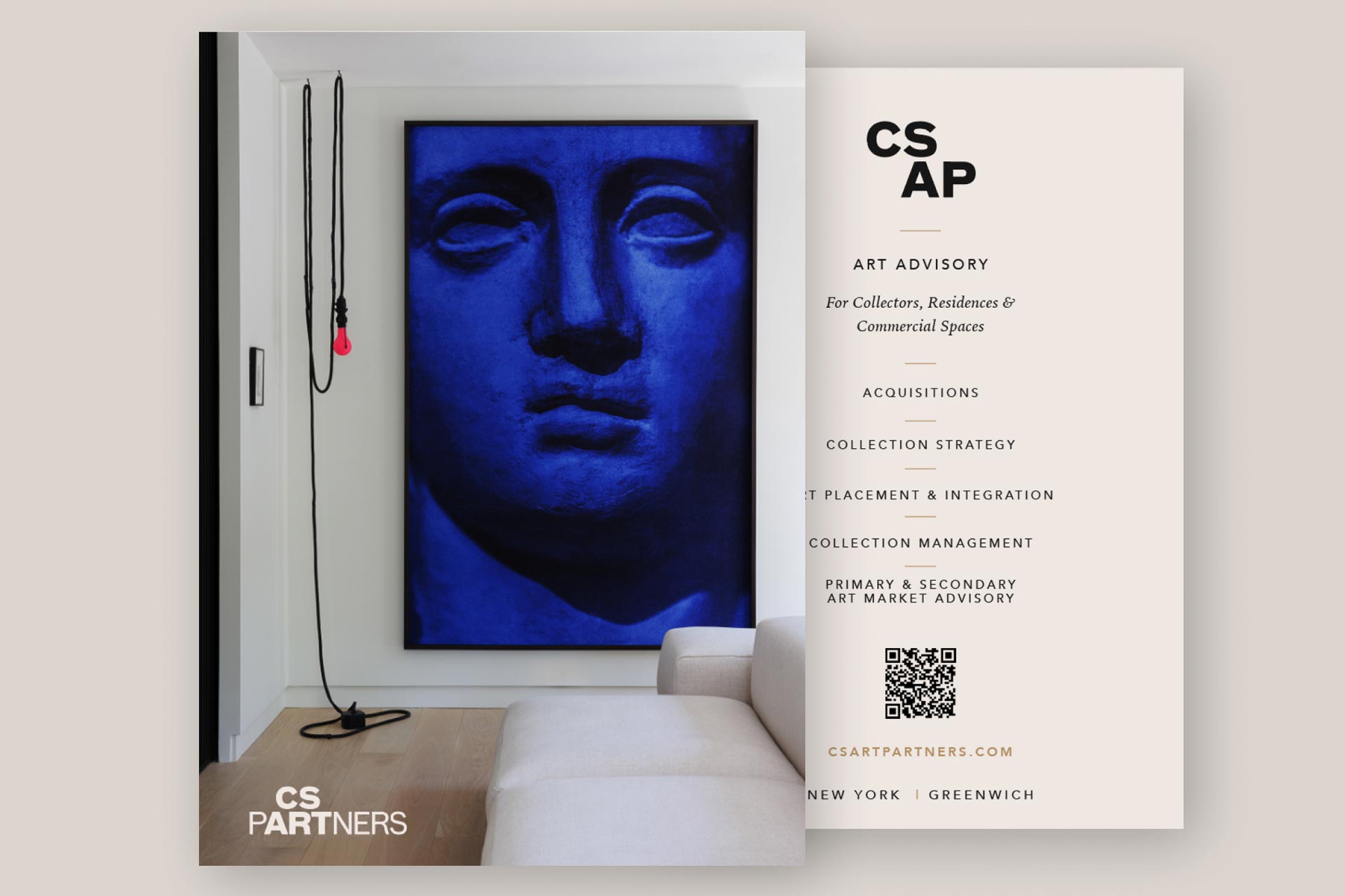
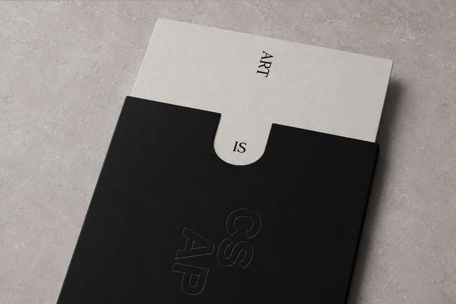
The logomark includes an alternative abbreviated format for use in small or discreet spaces, with a custom grid system providing both structure and rationale for the unique letter arrangement.

Craftsmanship as a Brand Signature

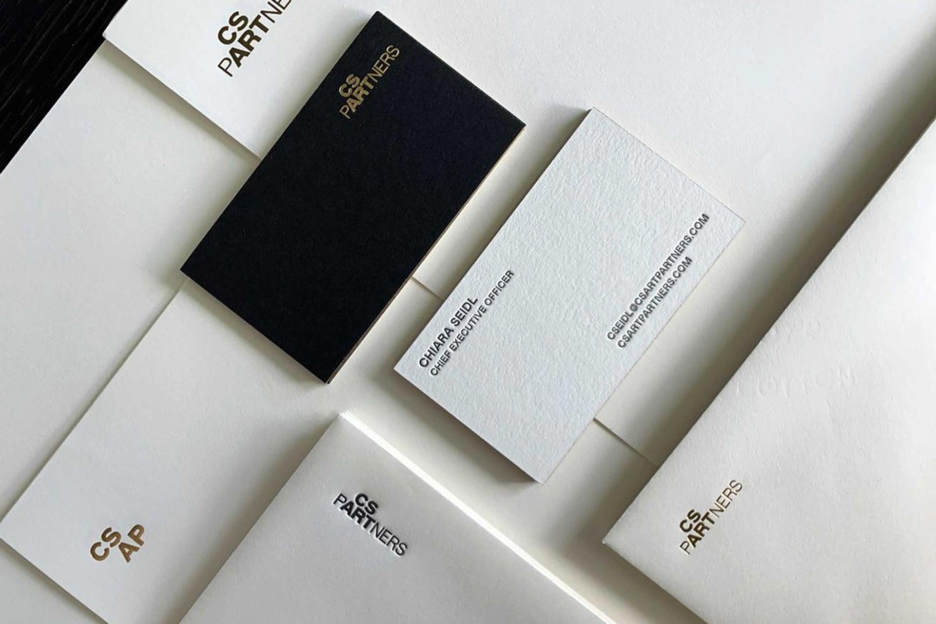
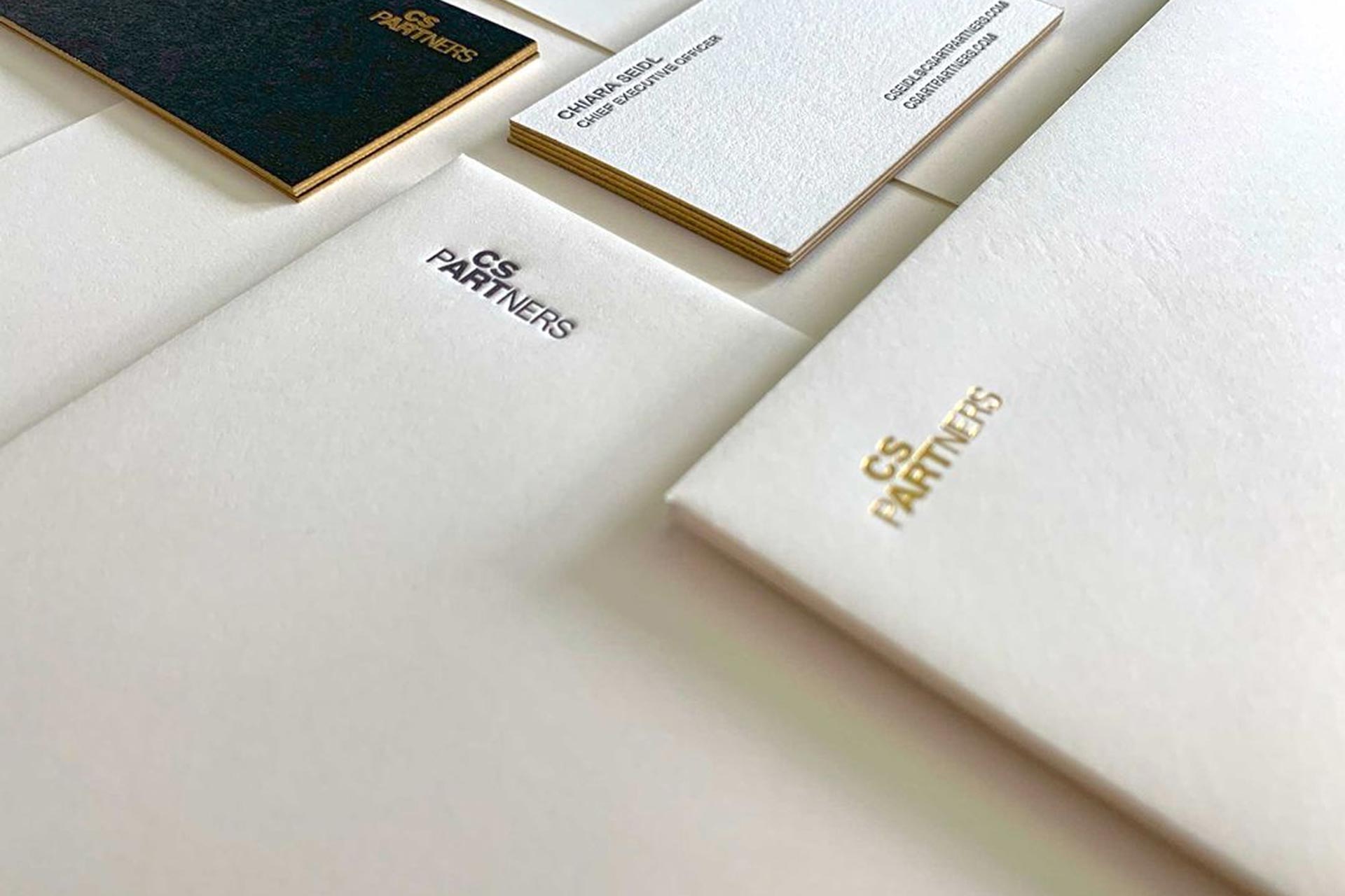
The brand extends into tactile, craft-driven applications that communicate the firm’s premium positioning. Business cards feature a painted gold foil edge that echoes the logo’s gilded qualities, while a combination of foil, deboss, and letterpress printing techniques brings depth and dimension to the physical identity.

Letterhead continues this elevated approach with a debossed mark that reinforces the firm’s commitment to detail and craftsmanship.

Where Art and Investment Meet

At the heart of the identity is the concept of lntersection—the convergence of art and investment, and the synergy created when these worlds align.

This idea informs the entire system, from the restrained color palette of Charcoal, Canvas, Marble, Terracotta, Stone, and Gold Leaf to the pairing of refined typography.

Fortescue, a serif with character and elegance, serves as the primary display type, while Mabry provides clarity and warmth for body copy. The logo stands apart with the exclusive use of FF Bau, giving the mark a distinctive and memorable presence.

A Digital Experience Rooted in Clarity and Confidence

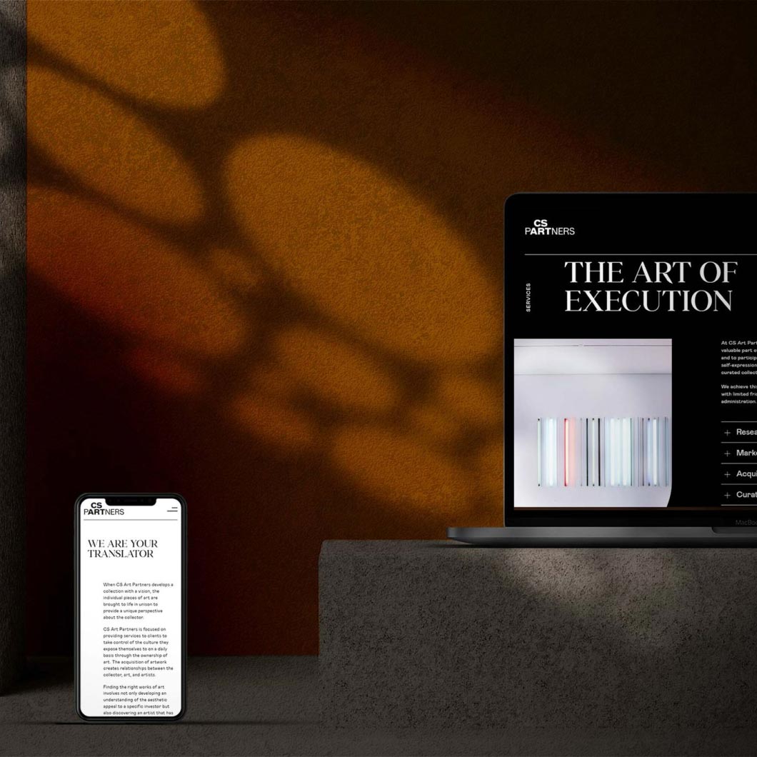
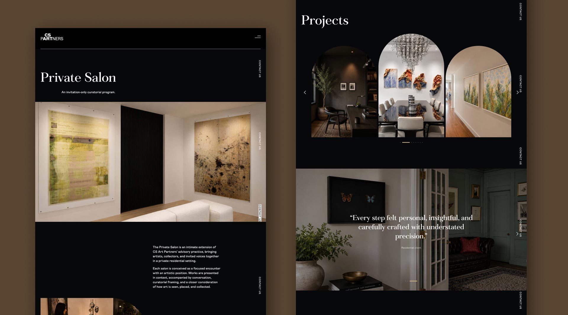
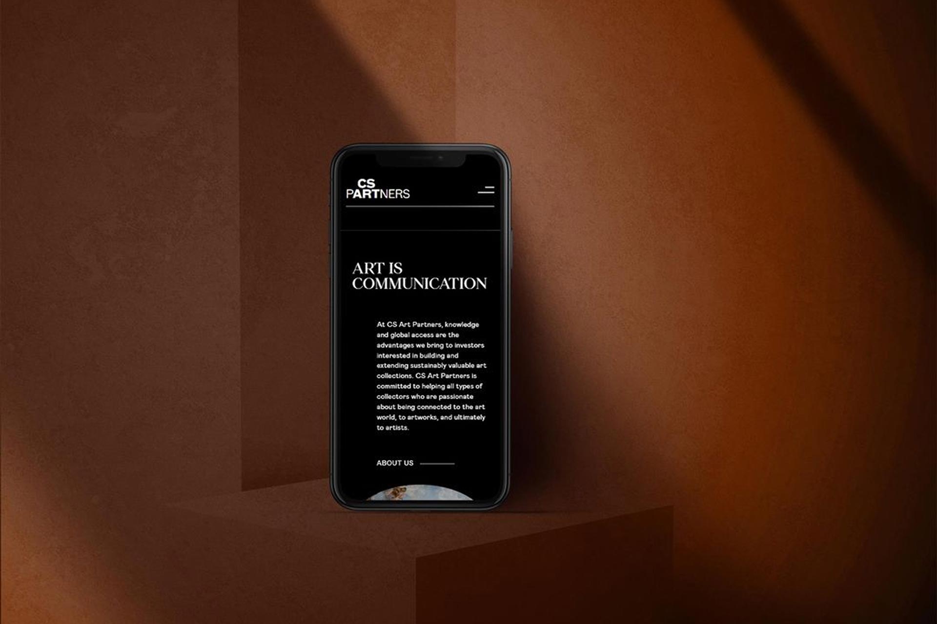
The brand comes to life online through a contemporary, intuitive website featuring a sticky header and contact button for seamless navigation.
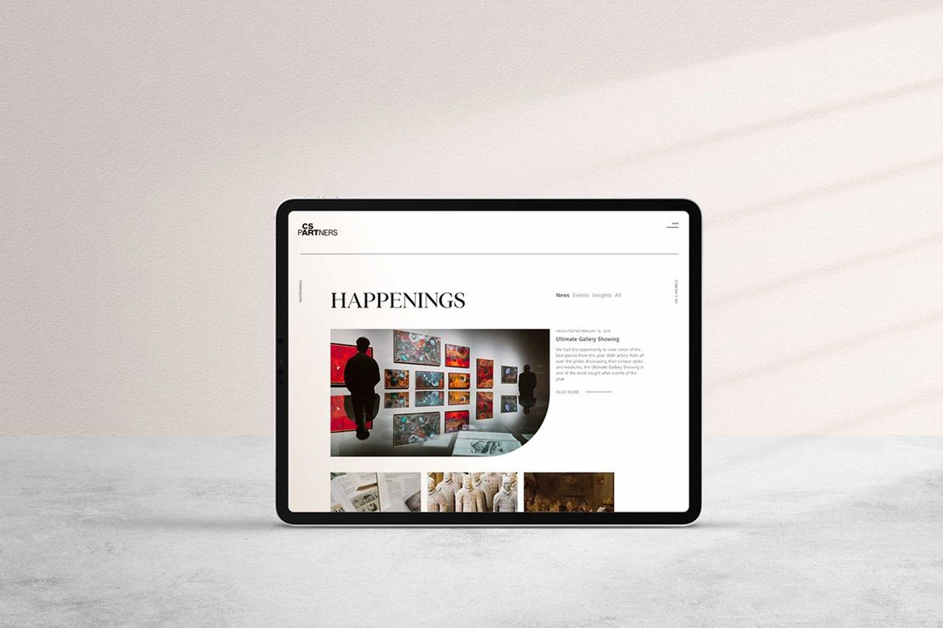
The homepage transitions from black-and-white to color, symbolizing clarity through expertise, while services are presented in expandable modules for easy exploration. News, Events, and Insights are organized for effortless browsing, and a streamlined Contact page ensures connecting with the firm is simple and refined.
SEO

SEO Global

About

PROJECT
  • Brand: SEO
  • Year: 2020–Present (6-year engagement)
  • Industry: Non-profit / Education
  • Location: New York, NY — Worldwide reach
  • Link:

    seo-usa.org

DELIVERABLES
  • Brand Management & Strategy
  • Multi-Program Identity Systems
  • Conference Graphics & Environments
  • Publication Design (Reports & Booklets)
  • Print & Digital Collateral
  • UX / UI Design
  • Website R&D
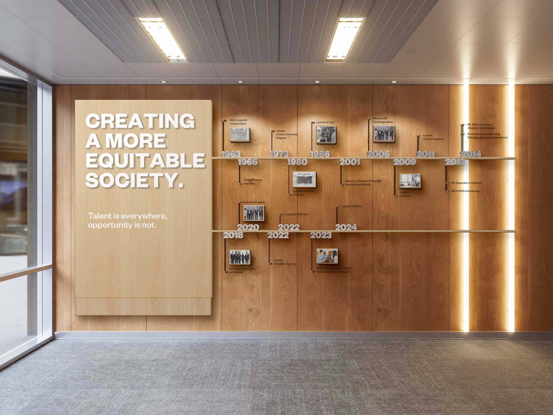
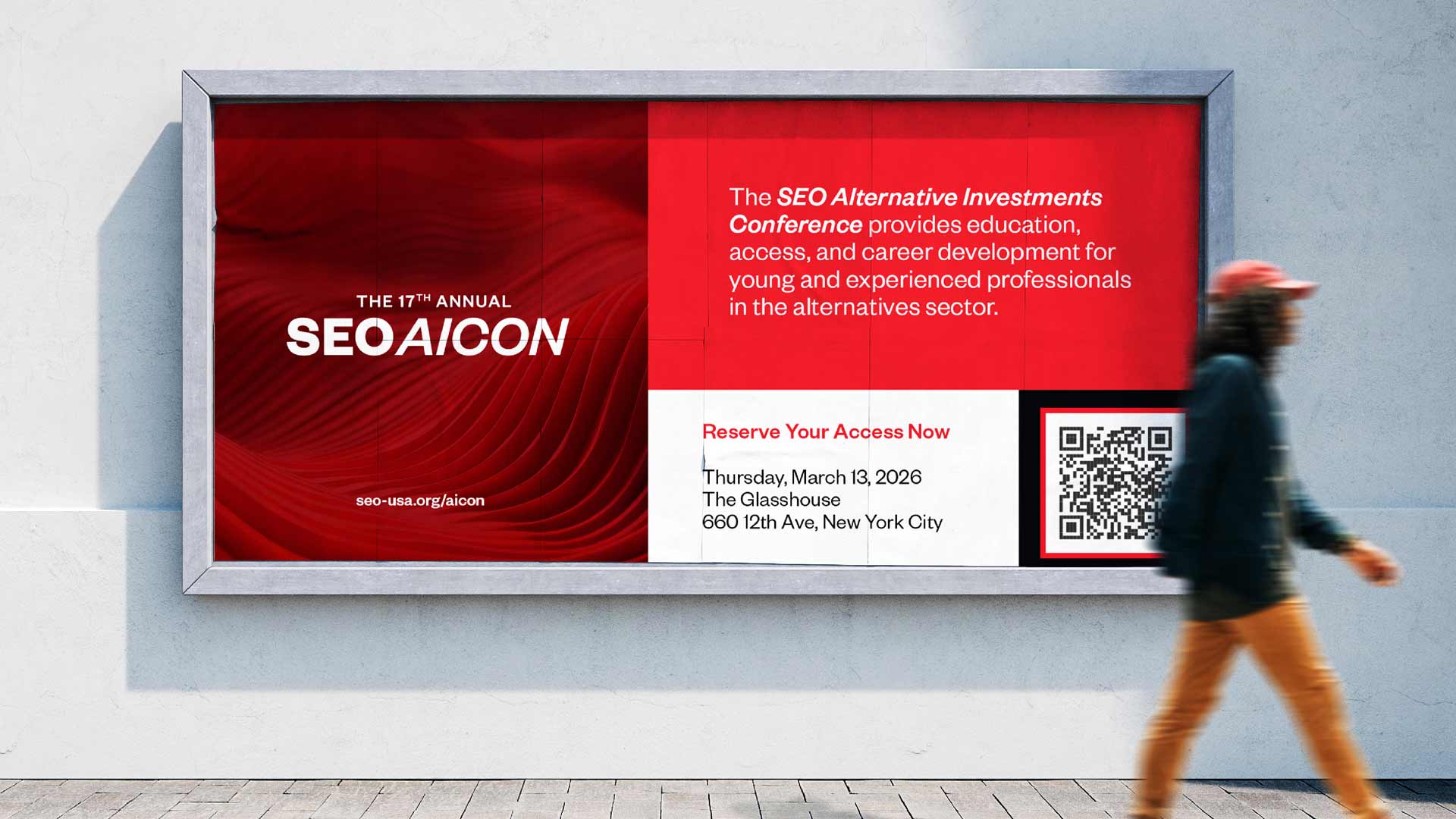
Since 1963, SEO has closed educational and career opportunity gaps for ambitious young people, growing into a network of 26,000+ alumni across 46 states and 48 countries. For the past six years, RPPL has served as SEO’s embedded brand partner — shaping how the organization shows up everywhere its work happens, from the page to the podium to the platform.

One Brand, Nine Programs

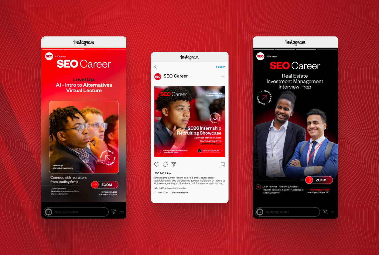
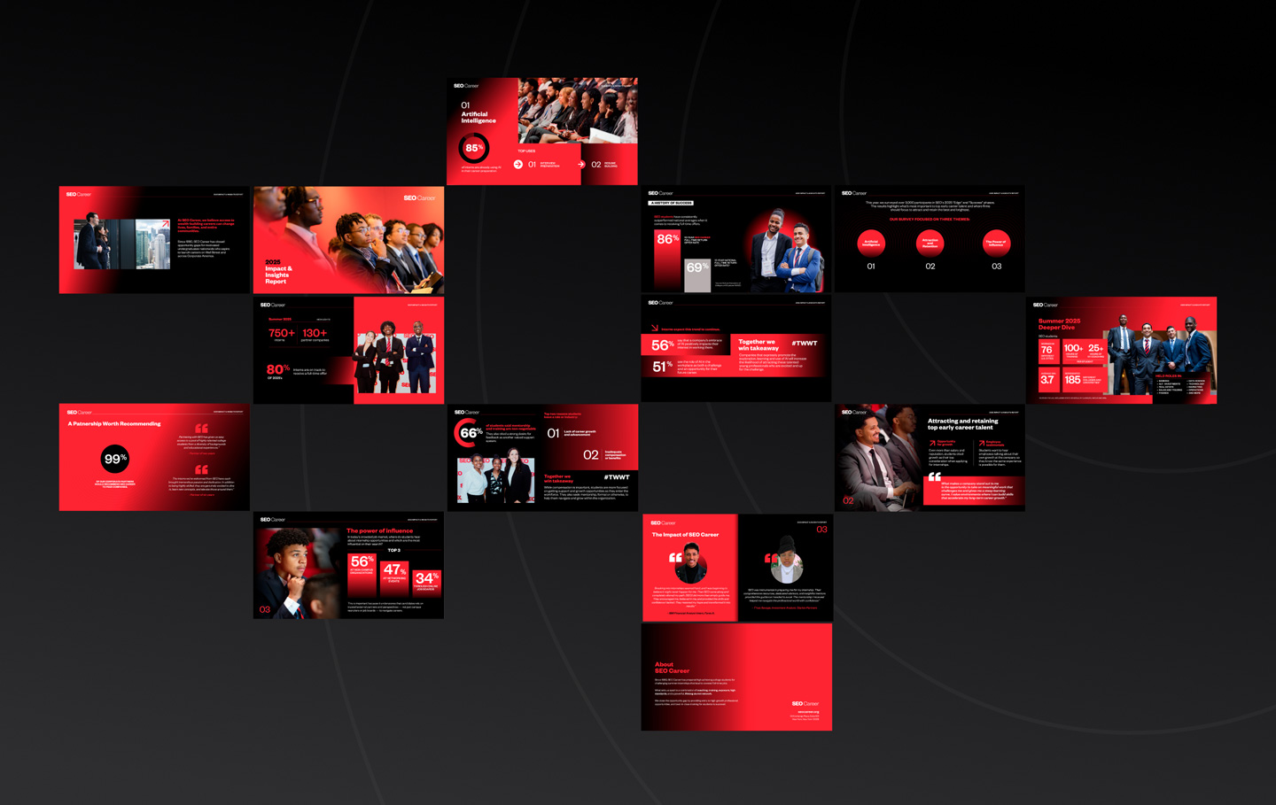
SEO isn’t a single initiative — it’s an ecosystem. Scholars, Career, Law, Tech Developer, Alternative Investments, and Leadership Institute each serve a different audience at a different stage of the opportunity pipeline, from public high schoolers to seasoned professionals.

Our challenge was to give each program room to speak to its own audience while ensuring every touchpoint was unmistakably SEO. We built a flexible identity system and a library of one-pagers, program collateral, and channel-specific materials that let each team move quickly without drifting from the brand.

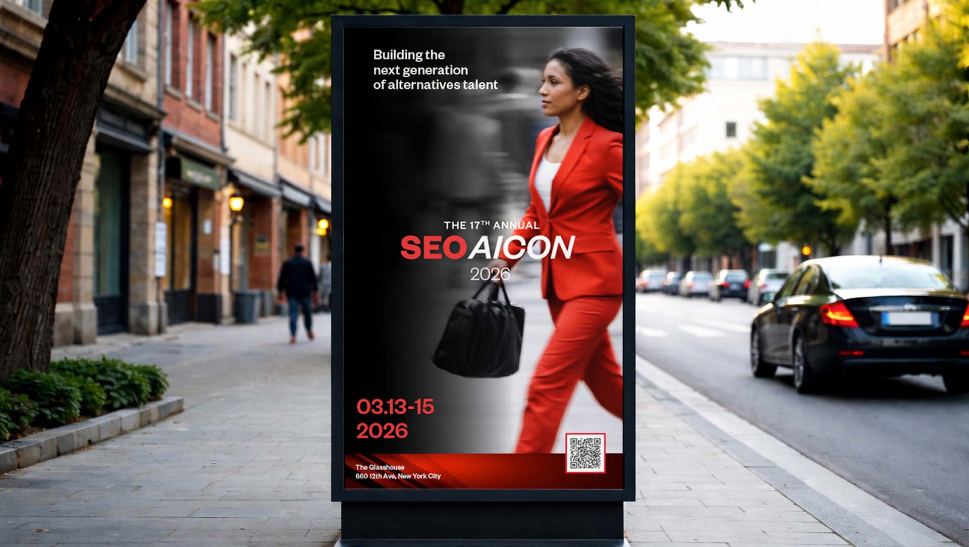
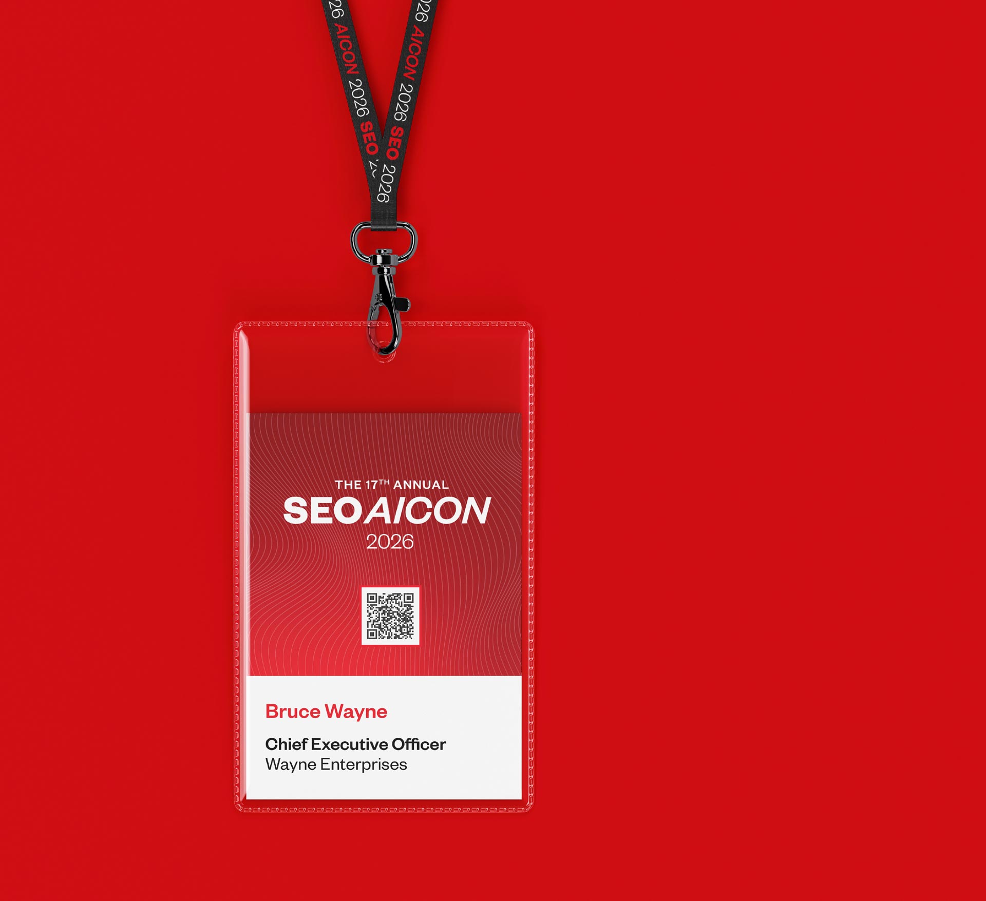
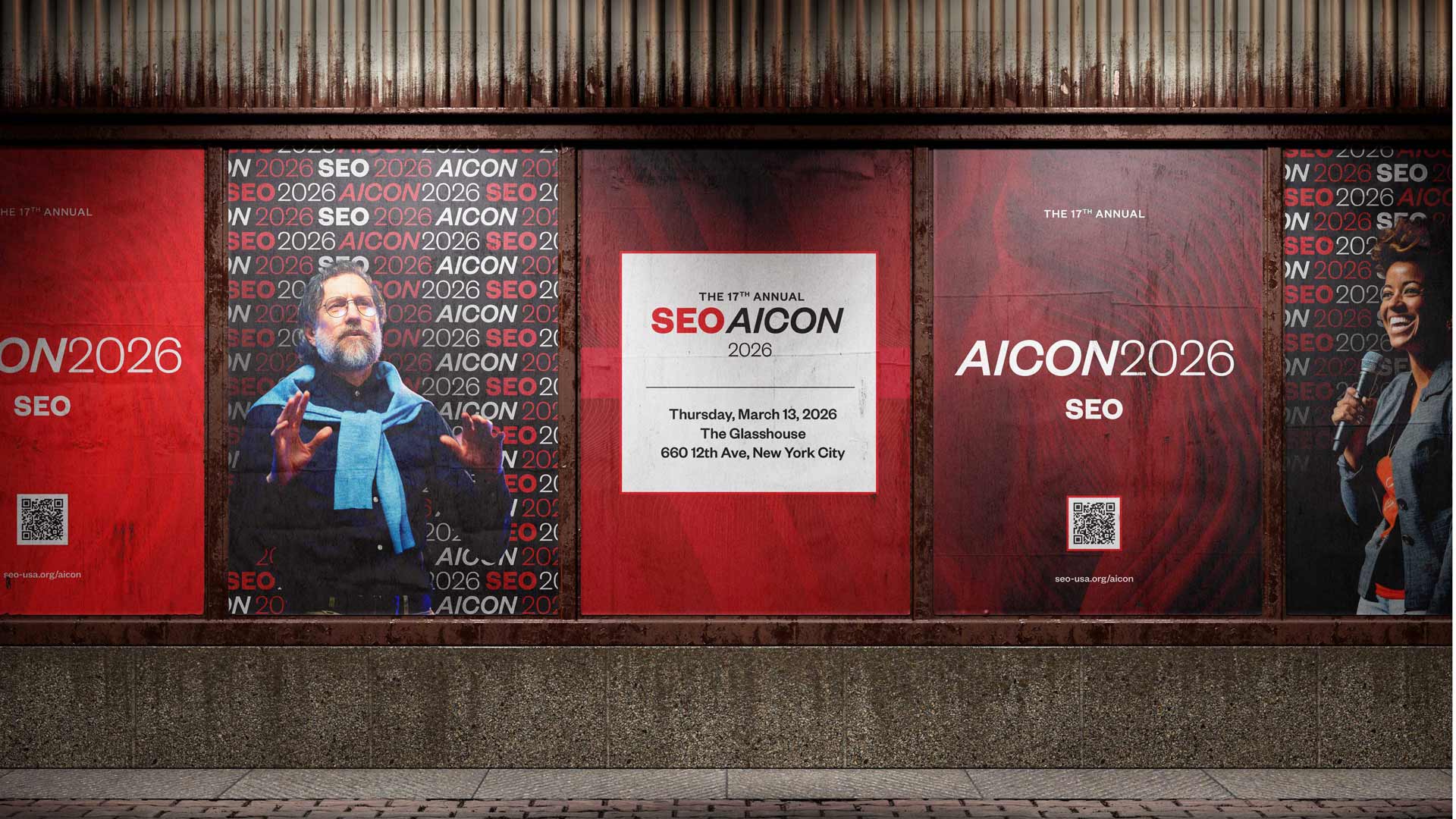
Bringing the Conference to Life

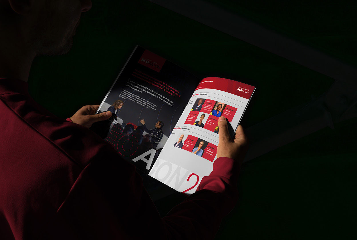
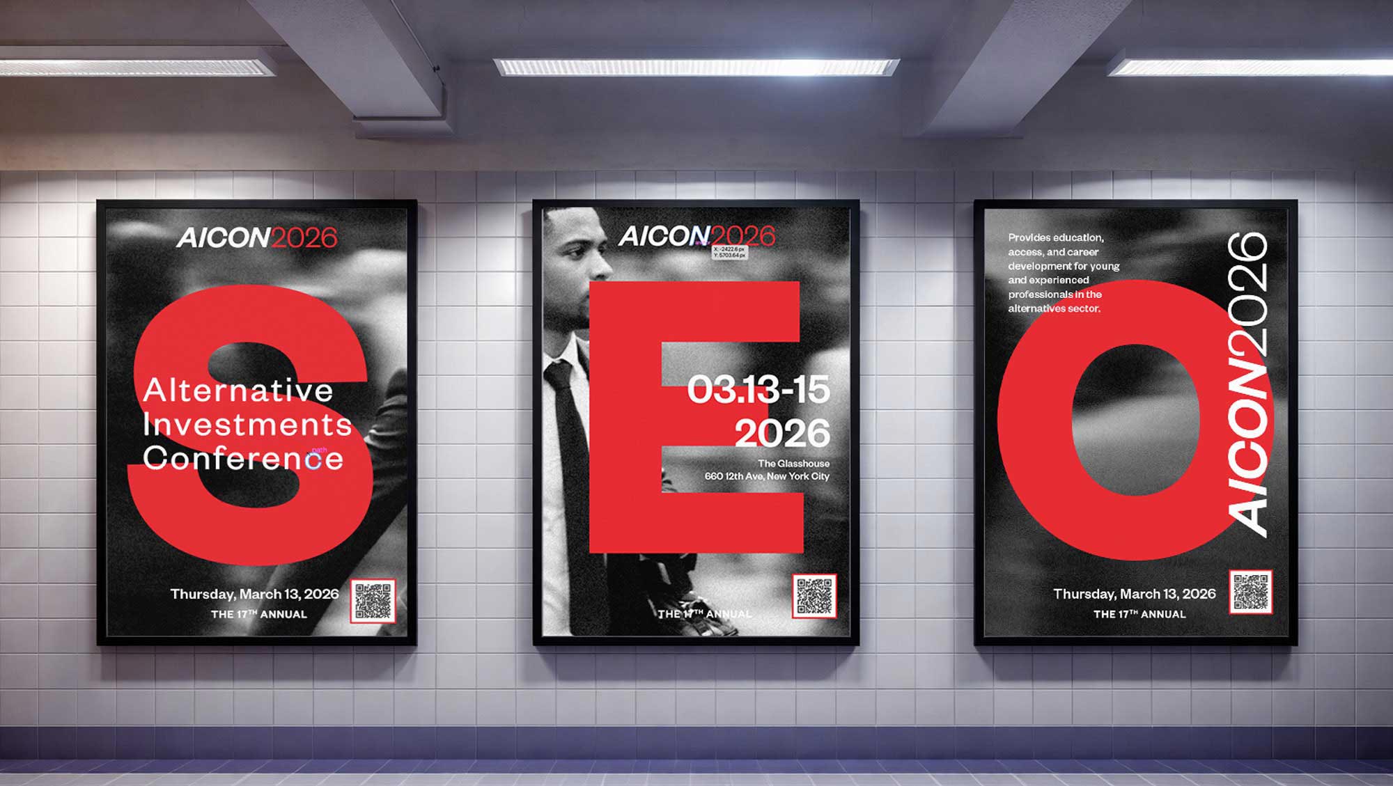
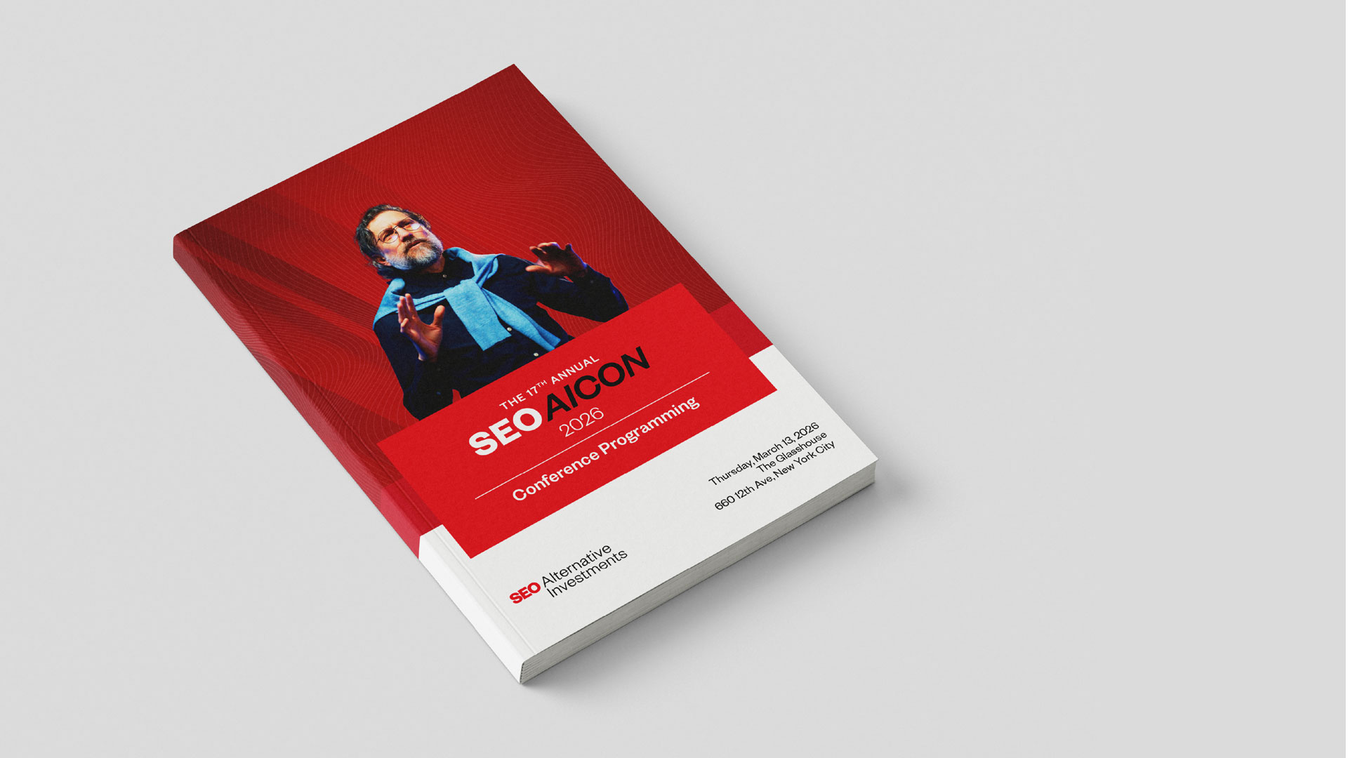
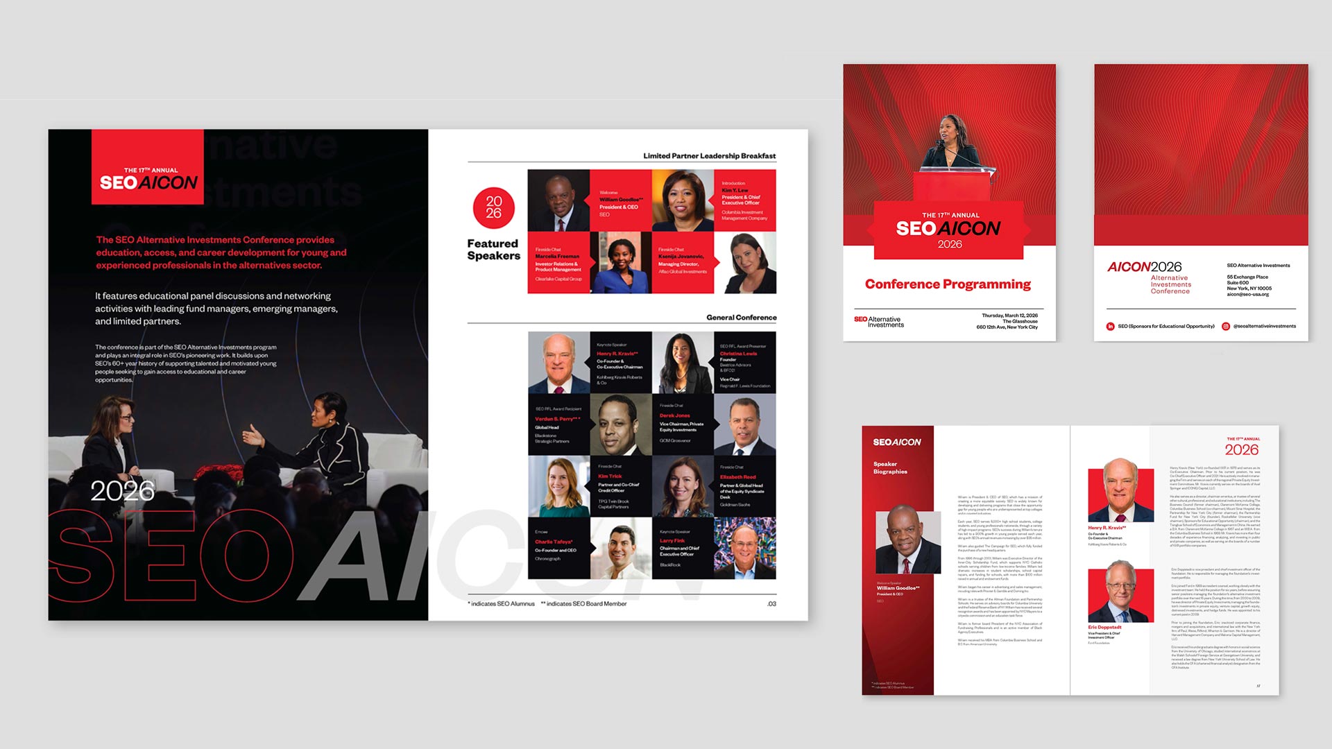
SEO’s flagship events are where alumni, students, and some of the organization’s most influential supporters come together. Over six years, RPPL has led the creative for the conference journal and the full on-site environment — signage, stage graphics, and spatial design that turn a program of remarks and recognitions into a genuine moment for the community.

Each year’s journal and environment builds on the last, evolving the visual language while keeping the through-line of SEO’s identity intact.

Publications Built to Be Read

Annual reports and program booklets carry real weight for SEO — they’re how funders, alumni, and partners understand the scale and impact of the work. RPPL designed these as long-form storytelling pieces: clear data visualization, a considered editorial rhythm, and a level of polish that matches the caliber of SEO’s supporters and outcomes.

Designing the Next Chapter

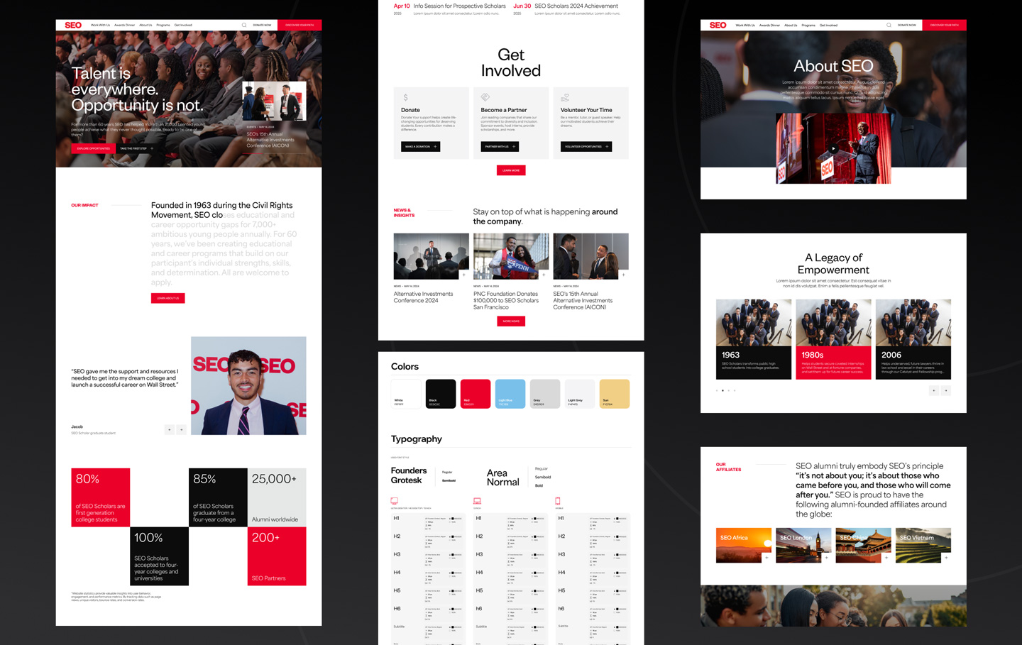
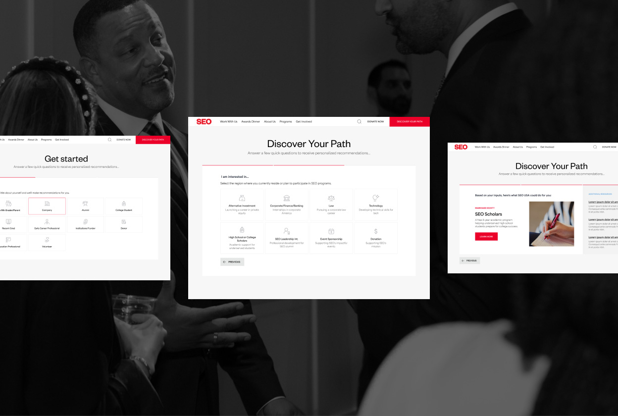
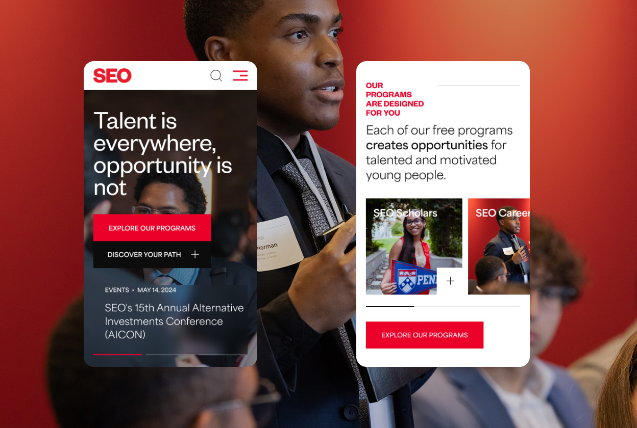
Most recently, RPPL has led the creative for SEO’s new website — from research and discovery through UX architecture and UI design. The goal was to translate a 60+ year legacy and nine distinct programs into a single digital experience that’s easy to navigate for a public high schooler exploring Scholars and a law student researching SEO Law alike.

A Partnership Built on Trust—Six years in, RPPL functions less like a vendor and more like an extension of SEO’s team — brought in early on new initiatives, trusted to protect the brand across nine programs, and given ownership of some of the organization’s highest-visibility moments, from the conference stage to the site currently in development.

REEF

Reef

About

PROJECT
  • Brand: Real Estate Endowment Fund
  • Year: 2026
  • Industry: Non-profit
  • Location: Nationwide
  • Link:

    impactwithreef.org

DELIVERABLES
  • Brand Strategy
  • Brand Identity
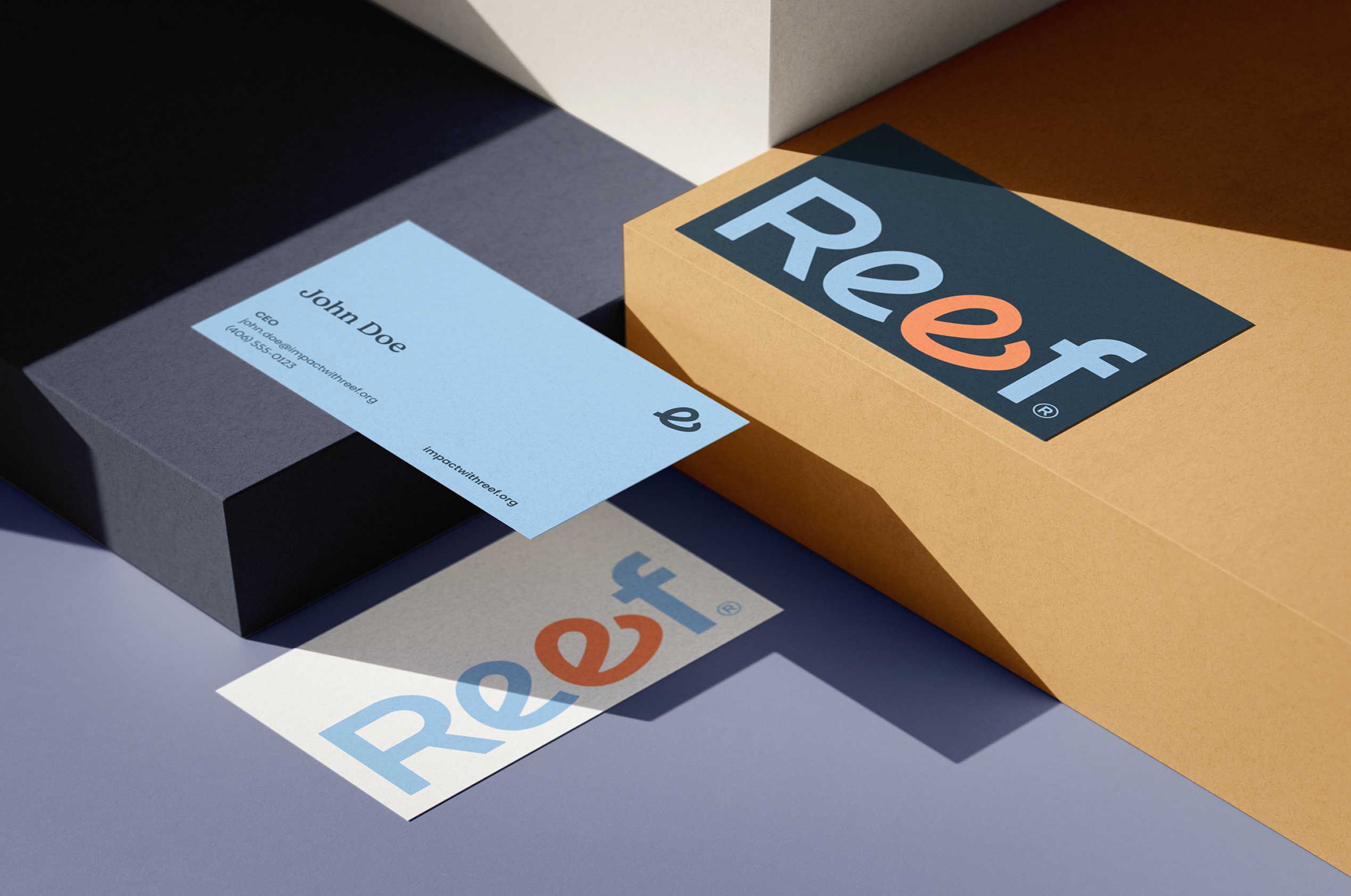
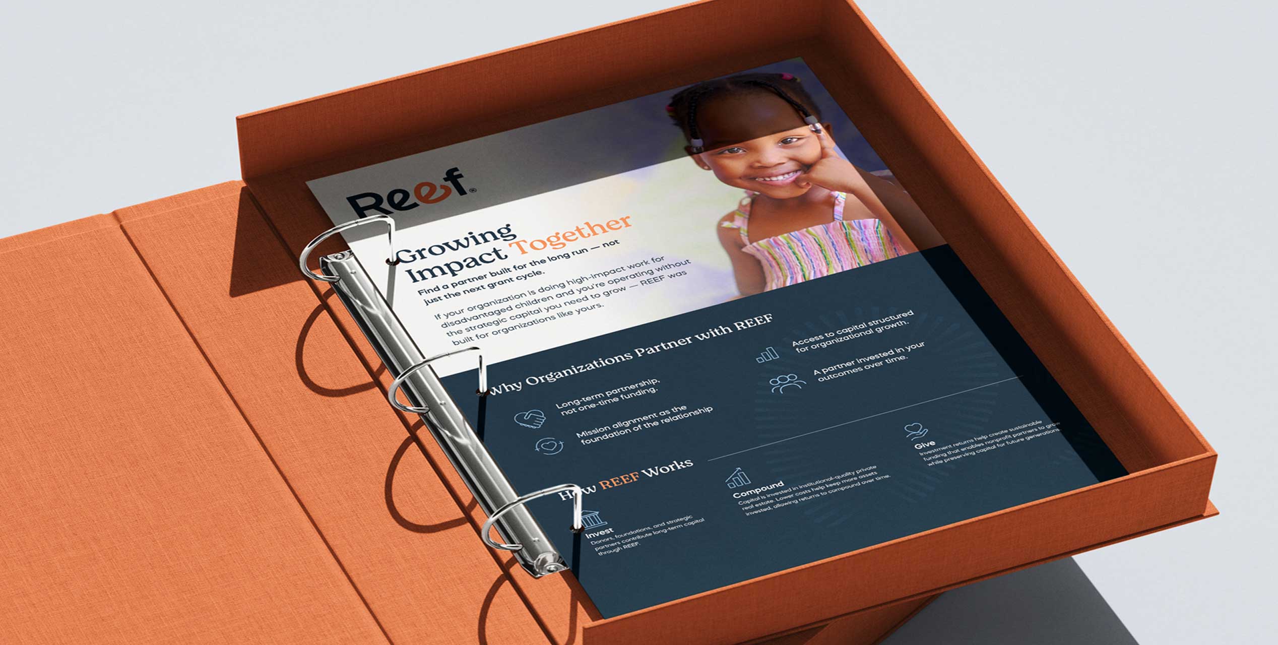
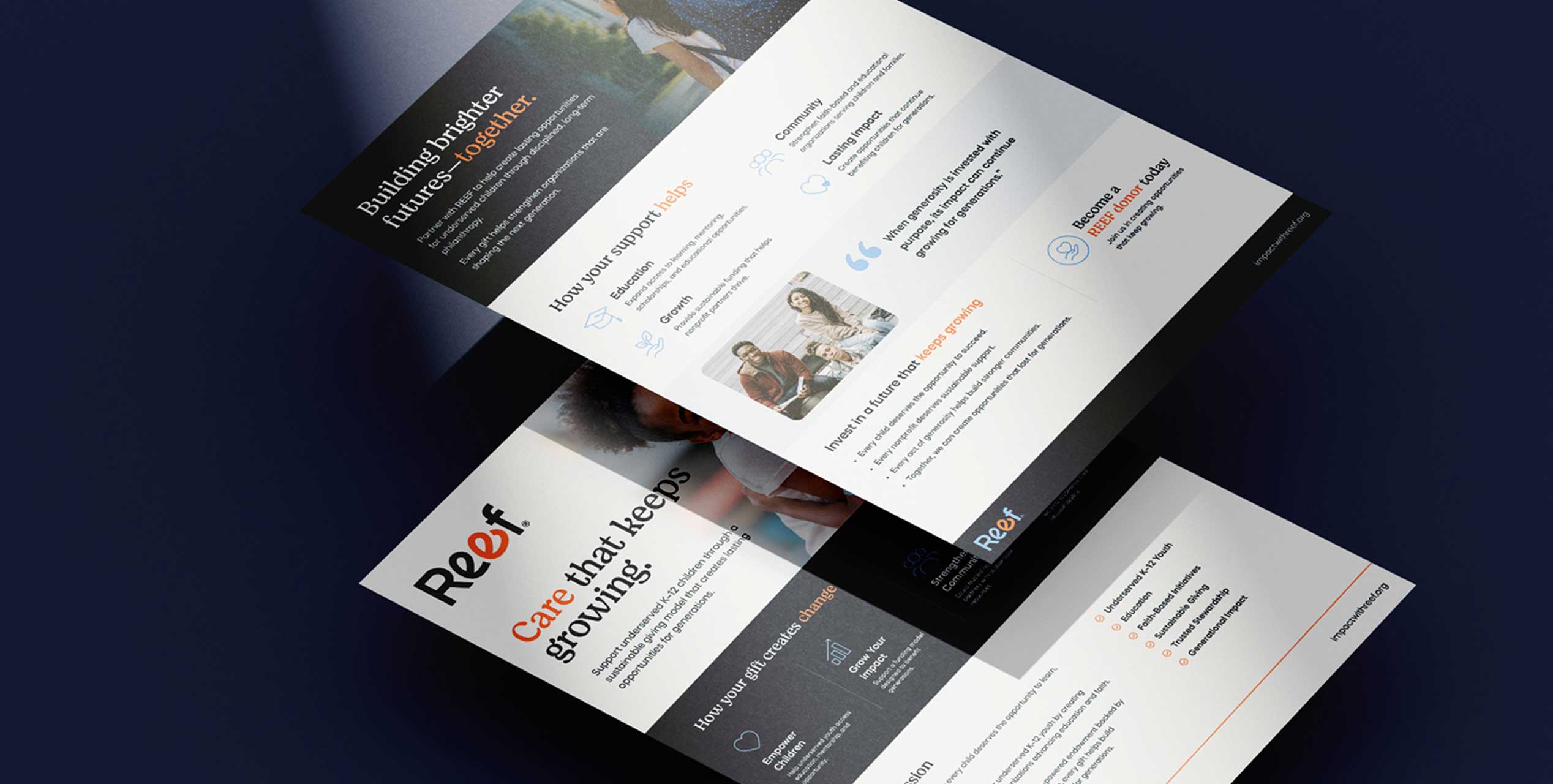
  • Collateral Suite (Stationery, One Pagers, Presentation Materials)
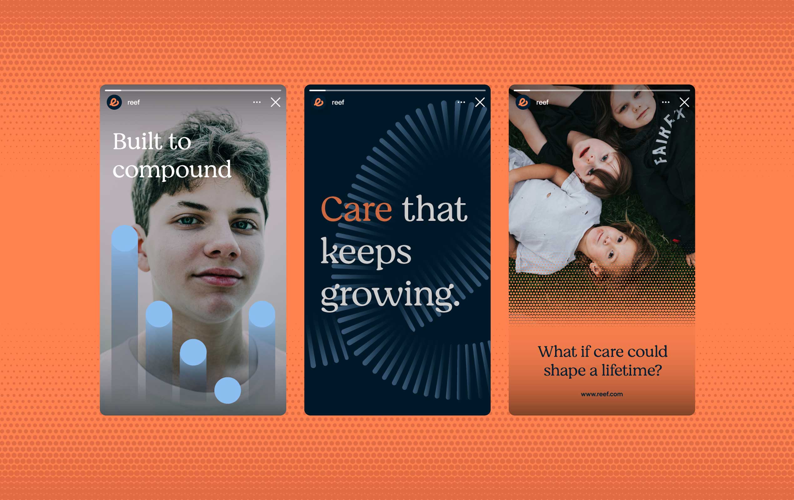
  • Digital & Social Advertising Creative
  • UX Design
  • UI Design
  • Website Development
A brand and digital experience built to make an unconventional idea feel obvious: that real estate investment discipline, applied to philanthropy, can change the trajectory of a child’s life.

Giving Capital a Long-Term Strategy

REEF — the Real Estate Endowment Fund — came to RPPL with a model that didn’t fit inside a typical nonprofit box. Rather than raise money year over year, REEF pairs donor capital with institutional-quality real estate investment, letting returns compound so that giving becomes a perpetual, growing source of support for underserved K-12 children rather than a one-time gift.

It’s a structure more commonly found in private equity than in philanthropy — and that was exactly the challenge. REEF needed a brand and a website that could hold two things at once: the rigor of an investment vehicle and the warmth of a mission built around children, education, and faith.

Our task was to translate that duality into something donors would trust with their capital and nonprofits would trust with their future.

A Wordmark That Carries the Message

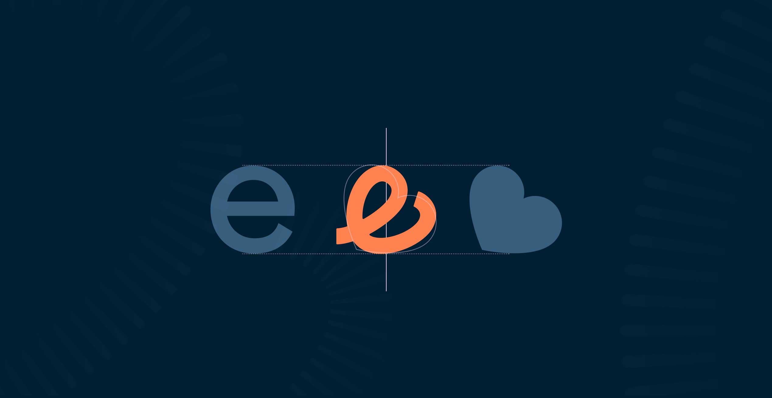
At the center of the identity is the REEF wordmark itself, where a small heart is built directly into the “e” — a quiet, permanent signal of the human intent behind every dollar deployed. It’s a detail that rewards a second look, much like the fund itself: institutional at a glance, personal on closer inspection.
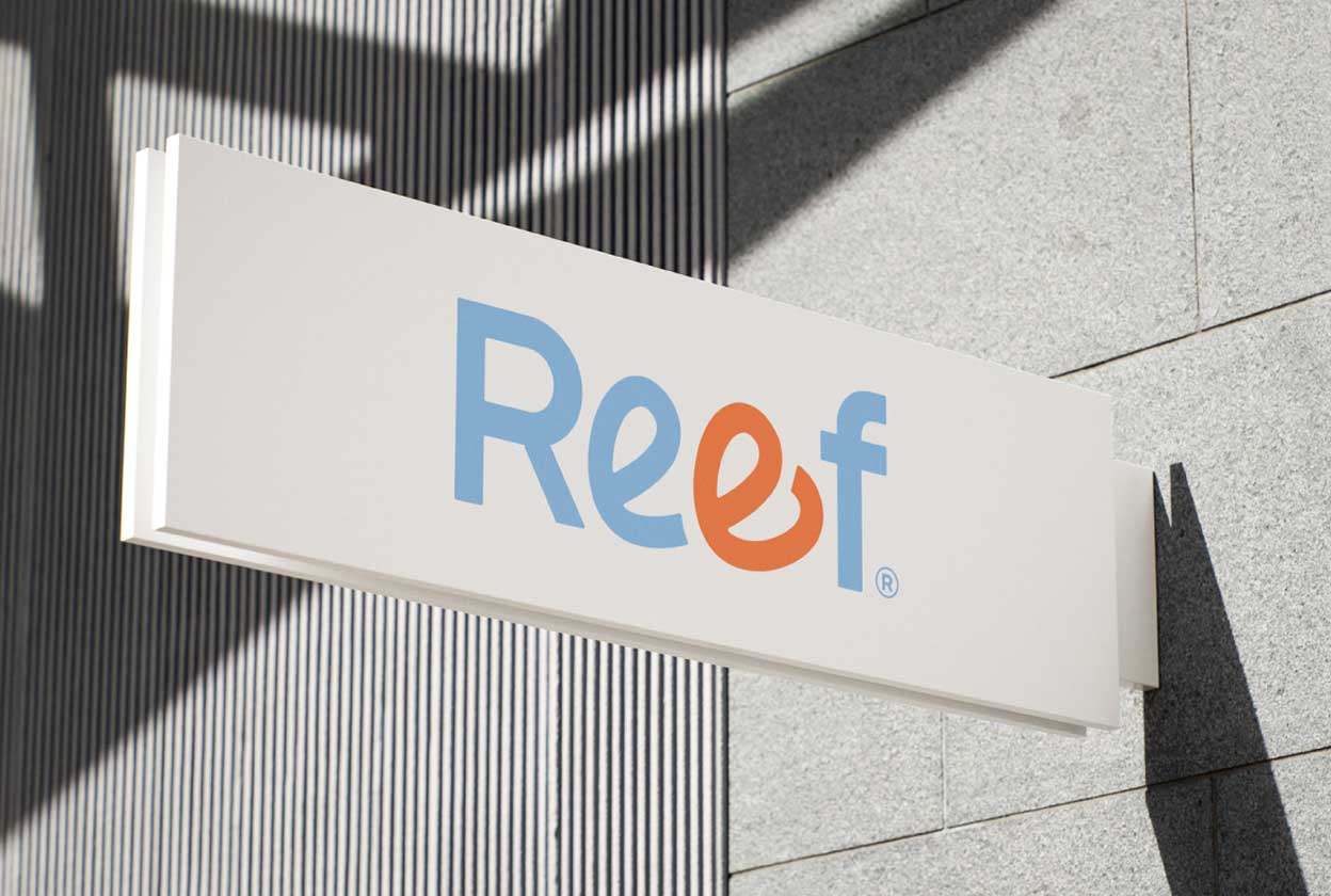
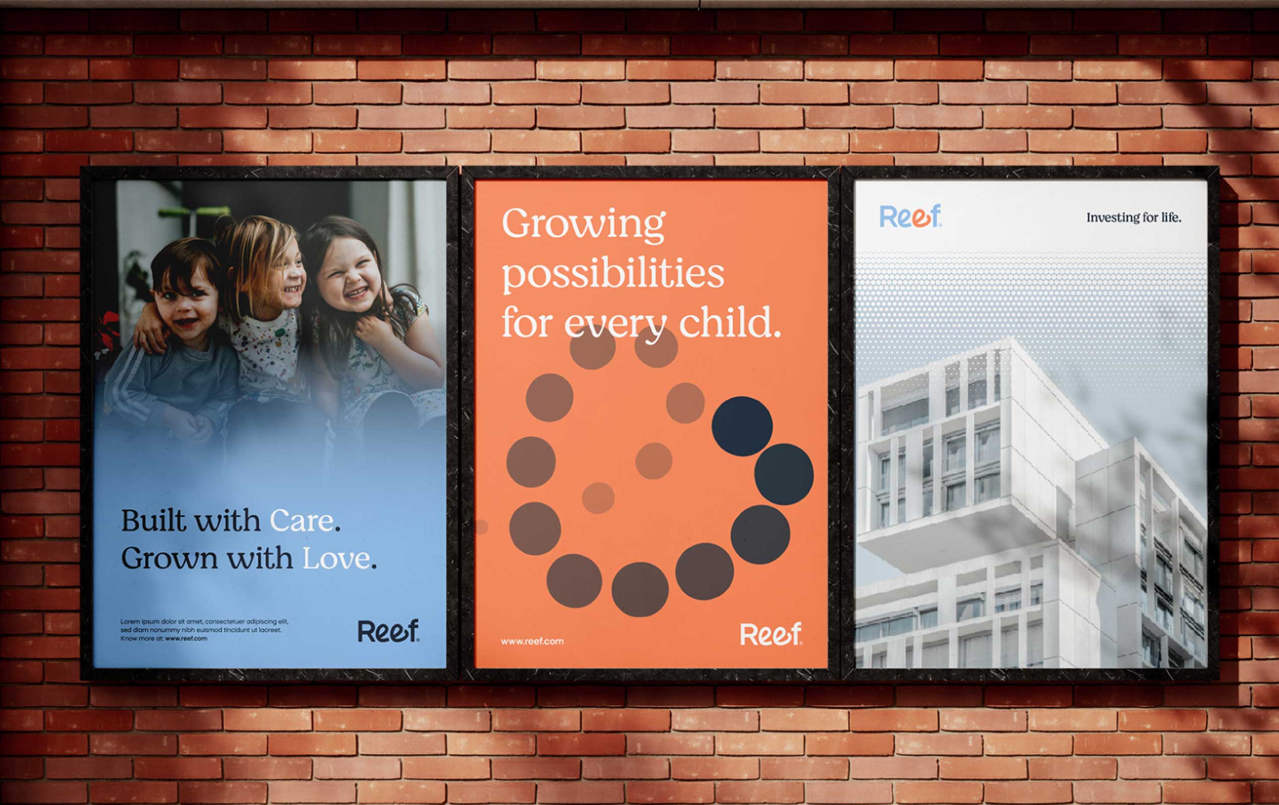
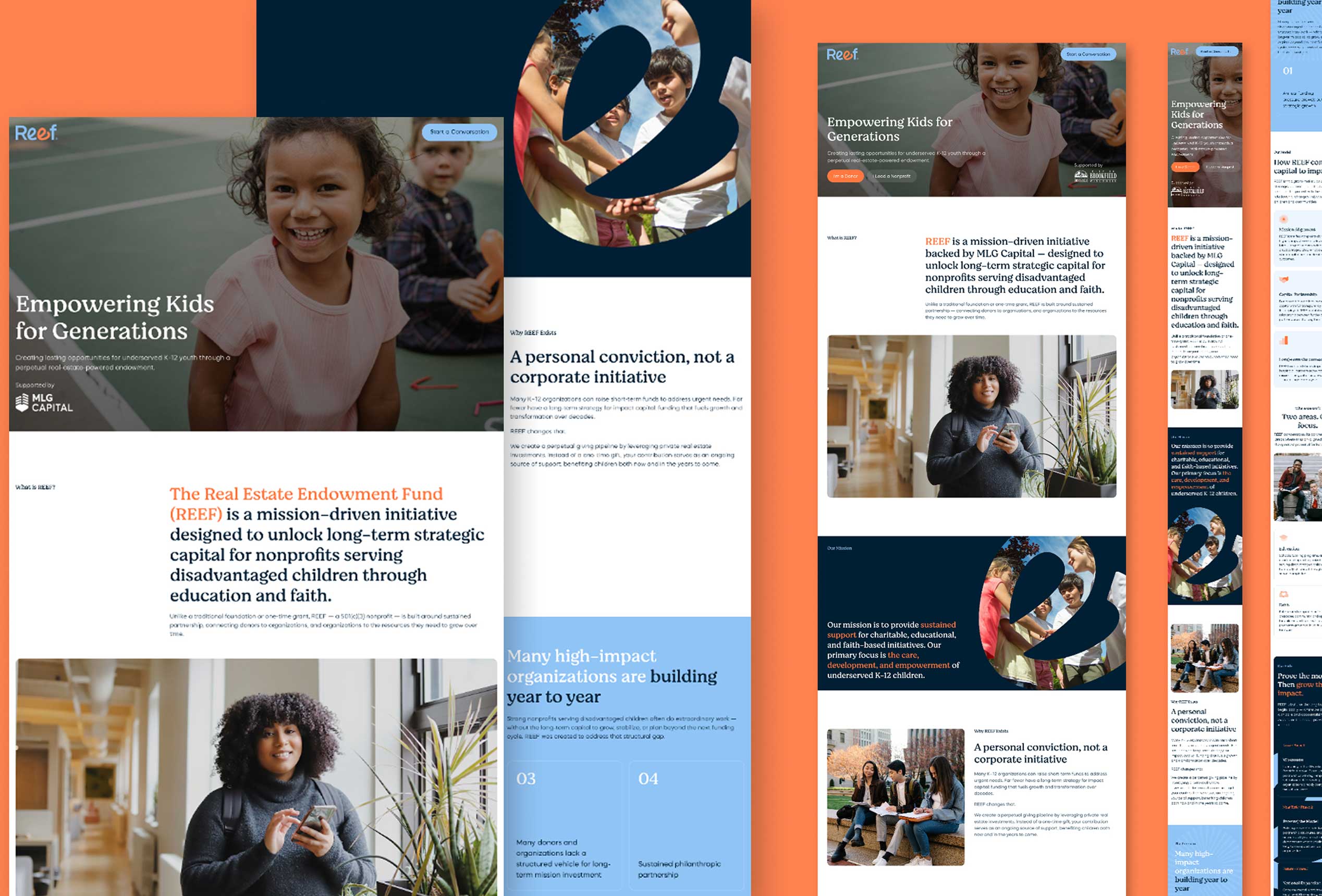
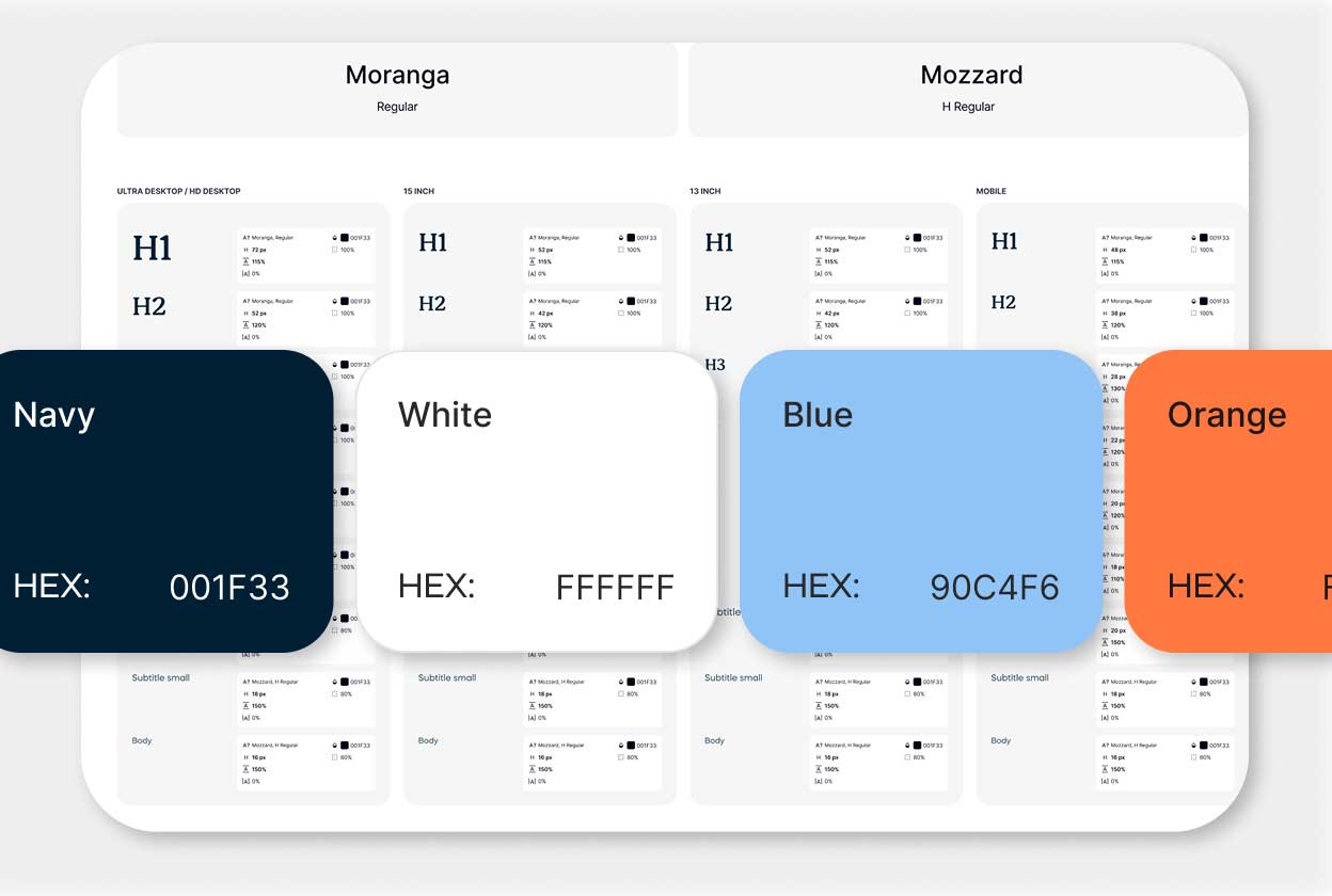
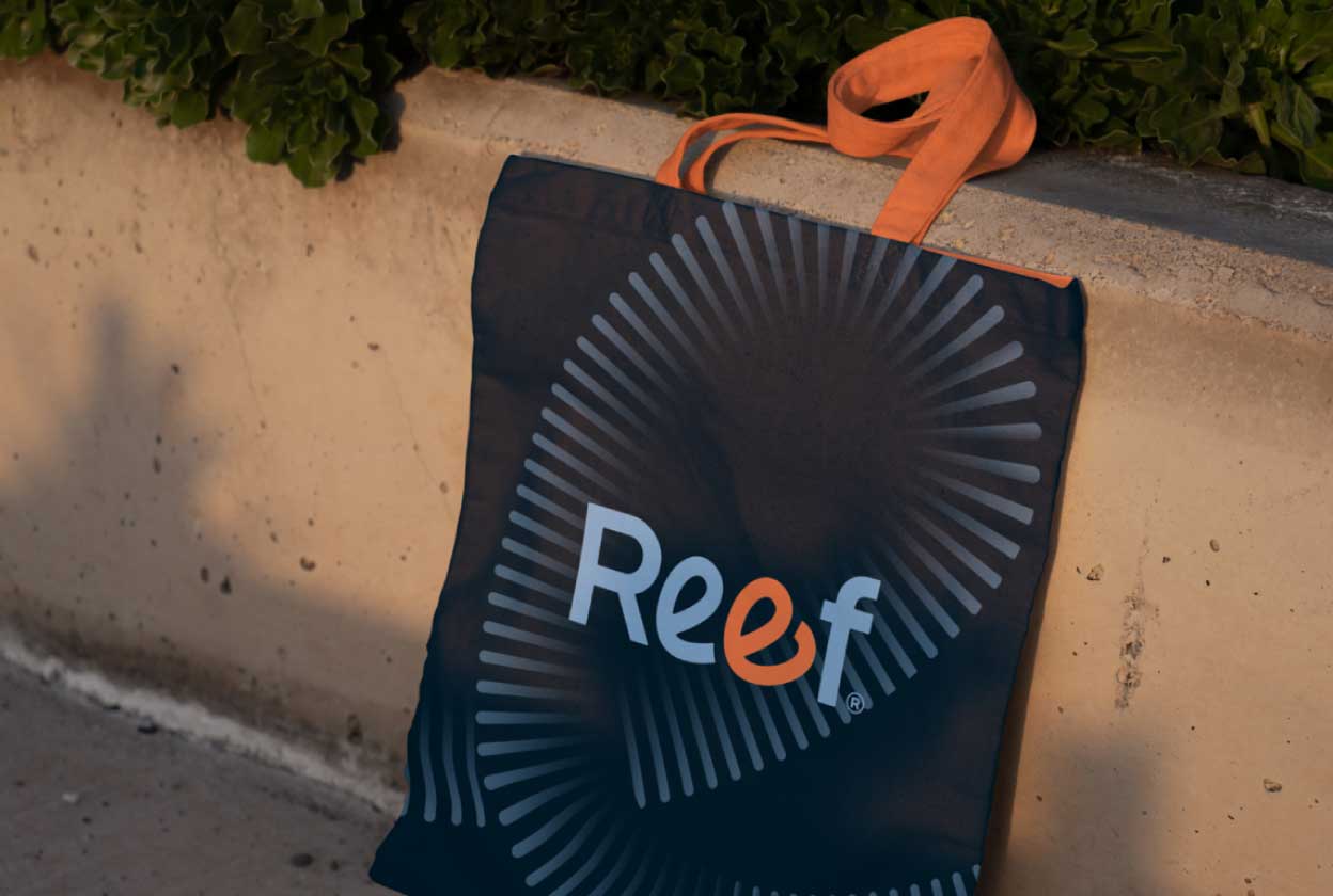
We paired a confident, rounded display face with a warmer serif for supporting copy, and built the palette around a sky blue and warm orange — colors that read as approachable and optimistic without tipping into a typical nonprofit or edtech look. Deep navy and clean white keep the system grounded and give the brand room to feel credible in a boardroom, not just a classroom.
The result is a mark that works as hard on a pitch deck for institutional donors as it does on a tote bag or a classroom banner — one identity, fluent in two audiences.

Designing for Two Audiences, One Site

REEF’s website had to do something most nonprofit sites don’t: speak fluently to sophisticated donors evaluating a capital structure, and to nonprofit leaders evaluating a funding partner — often in the same visit.

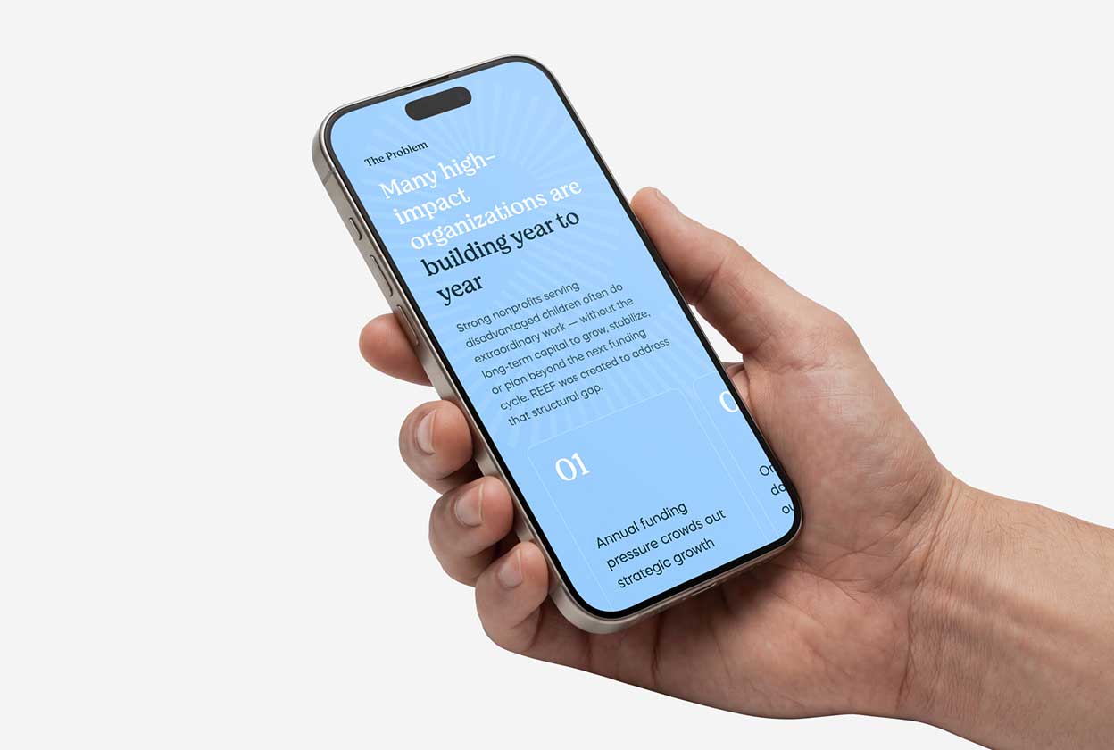
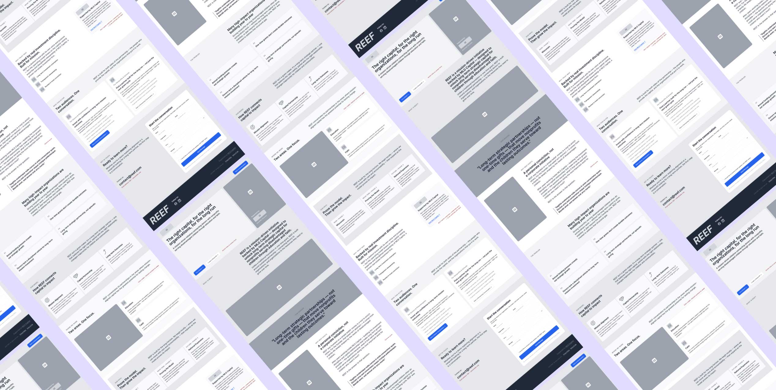
We structured the UX around that split. The site opens with REEF’s mission and model in plain terms, then earns the right to go deeper — walking visitors through the problem REEF solves, how the fund works, and the investment mechanics behind the compounding model, using clear data visualization to make the “power of compounding” tangible rather than abstract.

Rather than forcing every visitor down one path, the site resolves into two clear tracks — “For Donors & Philanthropists” and “For Nonprofits & Schools” — each with its own value proposition, proof points, and call to action, so a donor and a school administrator both leave knowing exactly what to do next.

Interface That Builds Trust

On the UI side, we leaned into REEF’s new visual language — warm photography of the children and communities REEF supports, set against clean, confident data presentation for the investment side of the story.

Every section was designed to move a visitor from emotional buy-in to financial confidence: mission and story up top, model and numbers as the visitor scrolls deeper. Custom components — the traditional-versus-REEF endowment comparison, the cost-savings breakdown, the “why trust REEF” credibility block — were built to make complex financial concepts scannable at a glance, without a donor ever needing a finance background to understand the upside.

Built and developed end-to-end by RPPL, the site gives REEF a digital home that matches the seriousness of the capital it manages and the warmth of the mission it serves.

A Brand Built to Compound

REEF now has an identity and a website that do more than describe the fund — they make its unusual model easy to understand and easy to trust, for donors weighing a long-term commitment and for nonprofits weighing a long-term partner.

From a single detail in a wordmark to a full donor-and-nonprofit digital experience, every piece was built around the same idea: that care, structured correctly, can keep growing for generations.